Kurz und prägnant: von Heuking Kühn Lüer Wojtek zu HEUKING
Winner
Excellence in Brand Strategy and Creation
Brand Design – Logo
Details
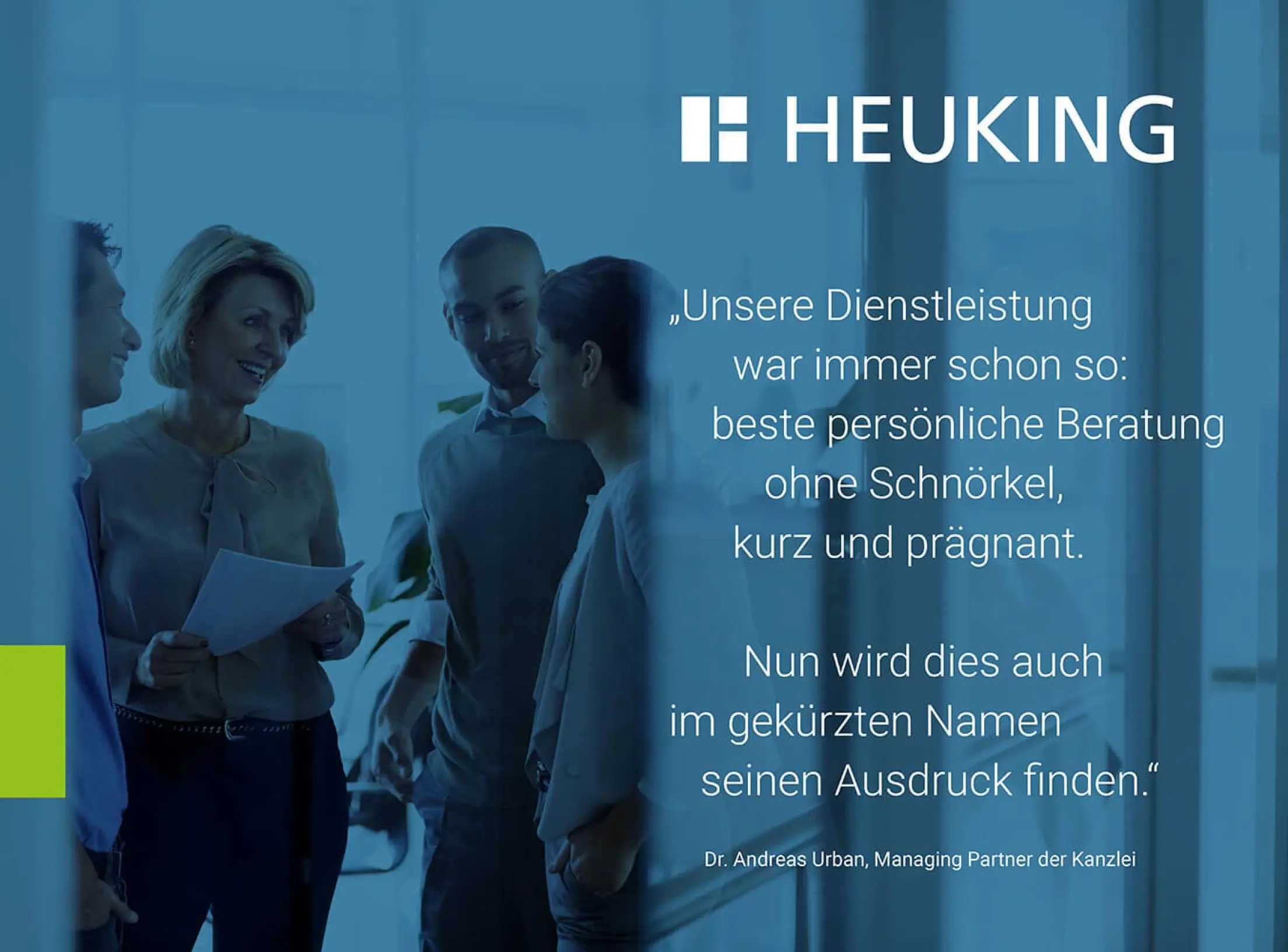
Business law firm HEUKING appears on the market with a streamlined logo and a modern appearance, thus increasing the brand's visibility. The logo will omit three of the name partners and be abbreviated to HEUKING. The brevity and clarity of the logo and the new, elegant corporate design symbolize the firm's focus: the most excellent service by giving personal advice in a succinct and straightforward manner. The short version is also relevant with regard to the firm's international presence.
The Jury‘s Statement
HEUKING has impressively repositioned itself with its new brand identity. The consistent decision to shorten the name to HEUKING and to modernise the corporate design reflects the clear and goal-oriented orientation of the firm. This strategy underlines the expertise and self-image of HEUKING: highest quality of advice, concise and without detours. The revised logo not only stands for increased visibility in the market, but also for dynamism and accessibility in an international context.