TUI MAGIC LIFE – Logo-Redesign
Winner
Excellence in Brand Strategy and Creation
Brand Design – Logo
Details
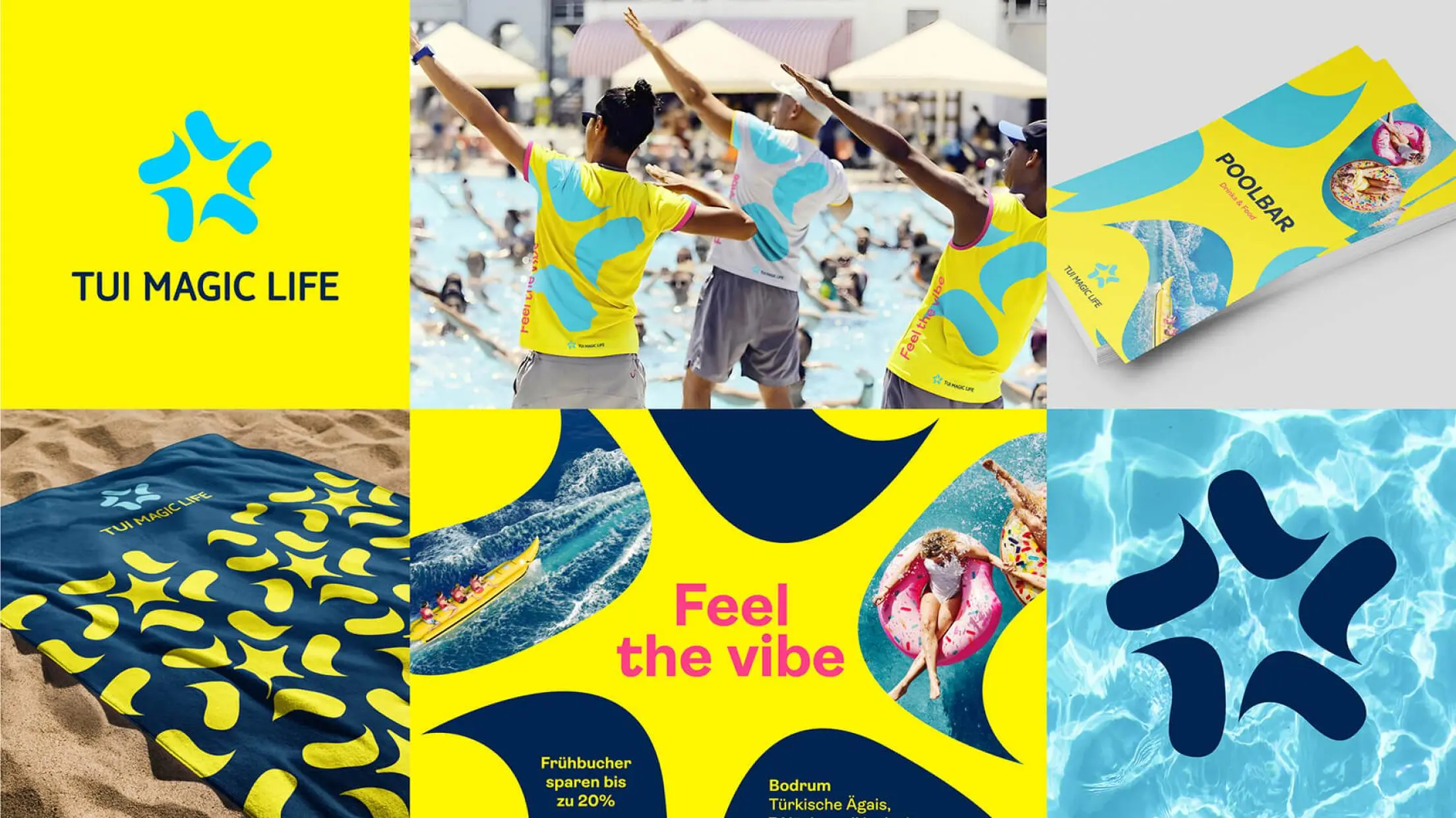
TUI Magic Life stands for upscale all-inclusive club vacations - for fun, entertainment and sports. The new logo of the brand should reflect all these aspects. The new "Star Splash" logo is at the heart of the brand identity: 5 dynamic drops of water, arranged in a star shape, which evoke associations of a starfish, togetherness in a group, water sports and sunshine. This is supported by the colours yellow and light blue. The modular logo is both a symbol and canvas for the entire communication.
The Jury‘s Statement
TUI MAGIC LIFE has created a remarkable visual innovation with the »Star Splash«logo. The five dynamic, star-shaped water drops not only symbolize a starfish, but also embody the essence of community, water sports and sun joy, supported by a fresh color palette of yellow and light blue. The modular and versatile logo serves as a lively communication tool that represents the brand in all its facets. The successful fusion of symbolism and functionality sets new standards in brand design and clearly sets TUI MAGIC LIFE apart from the competition.