Rebranding EASY SOFTWARE AG
Winner
Excellence in Brand Strategy and Creation
Brand Design – Corporate Brand
Details
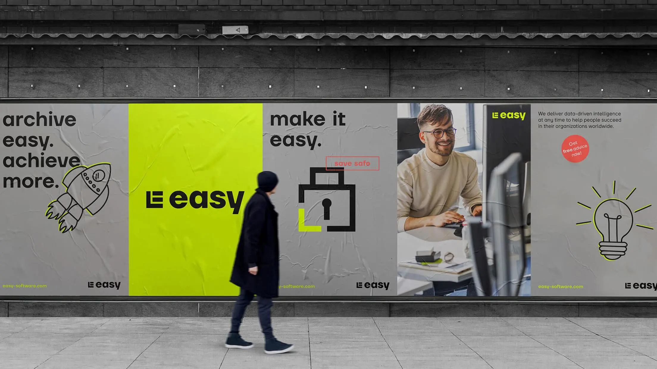
As a leading ECM software manufacturer, easy has stood for digital archiving since 1990. 31M developed a completely revised corporate design based on the vision "We are the pulsating data heart in the world’s most successful companies.". The neon colour easy Pulse Glow determines the activating colour world and the stylized E represents a data cube, which develops into an independent image world in 3D visuals. The corporate type "easy head" underlines the digital expression.
The Jury‘s Statement
EASY SOFTWARE has set an exclamation mark with its redesign of the brand image. The introduction of the neon color "easy pulse glow" and the data cube logo creates an activating and innovative visual identity that perfectly reflects the company’s vision as a pulsating data heart. Particularly noteworthy is the involvement of the employees through a cinema event, which strengthened the internal brand loyalty and led to a great success. This creative and strategic approach to the relaunch shows that EASY SOFTWARE creates a new dimension of brand perception.