Corso Italia Rebrand
Winner
Excellent Brands
Non-Governmental Organizations and Public Affairs
Details
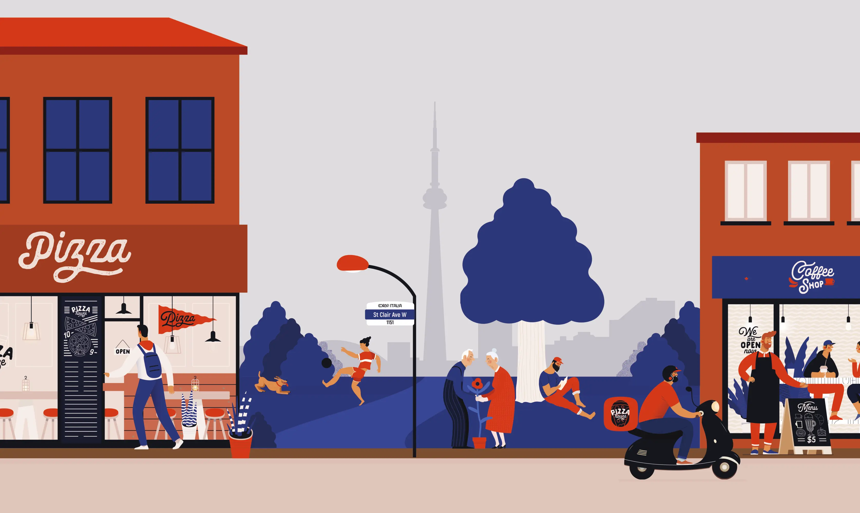
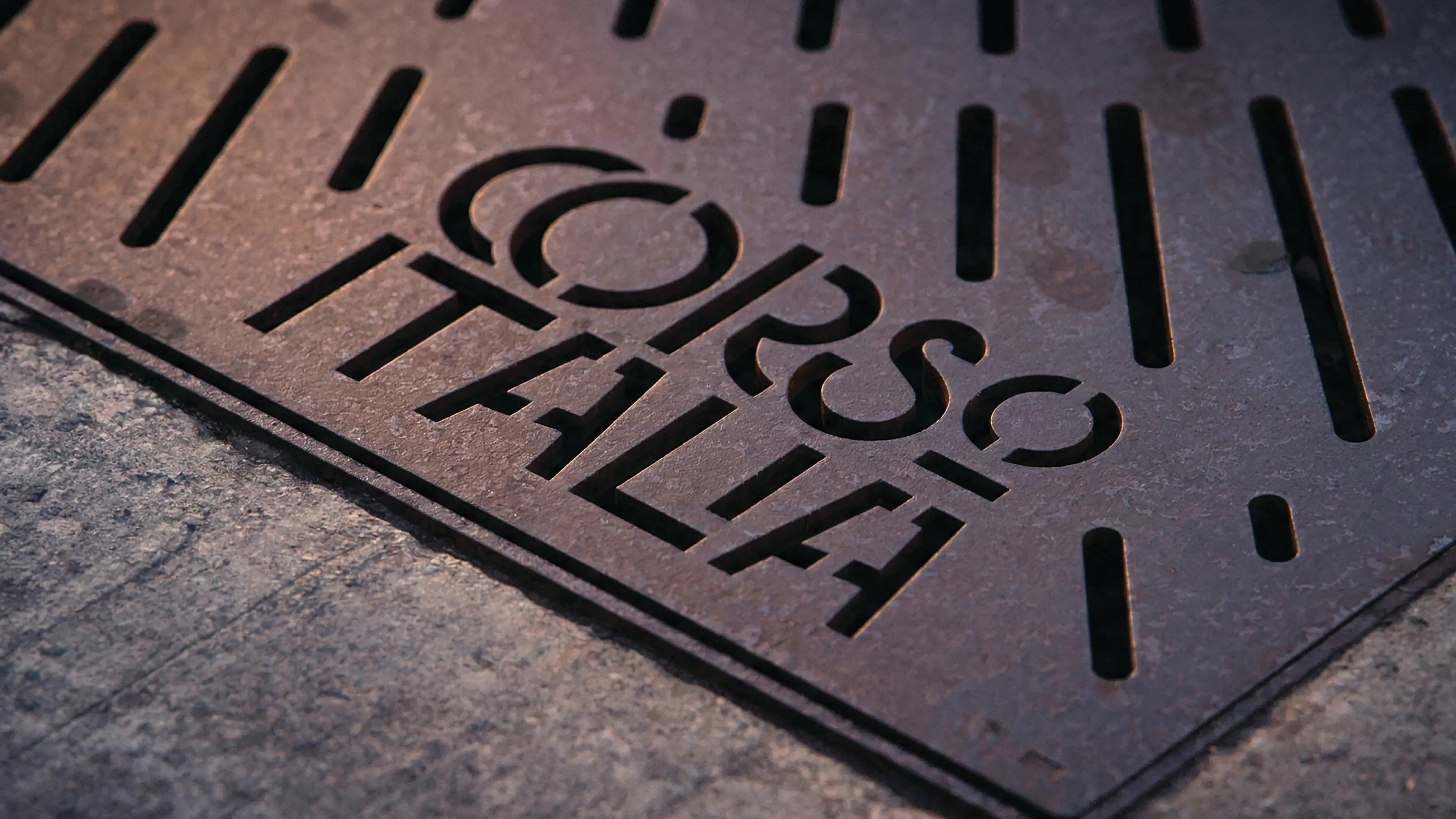
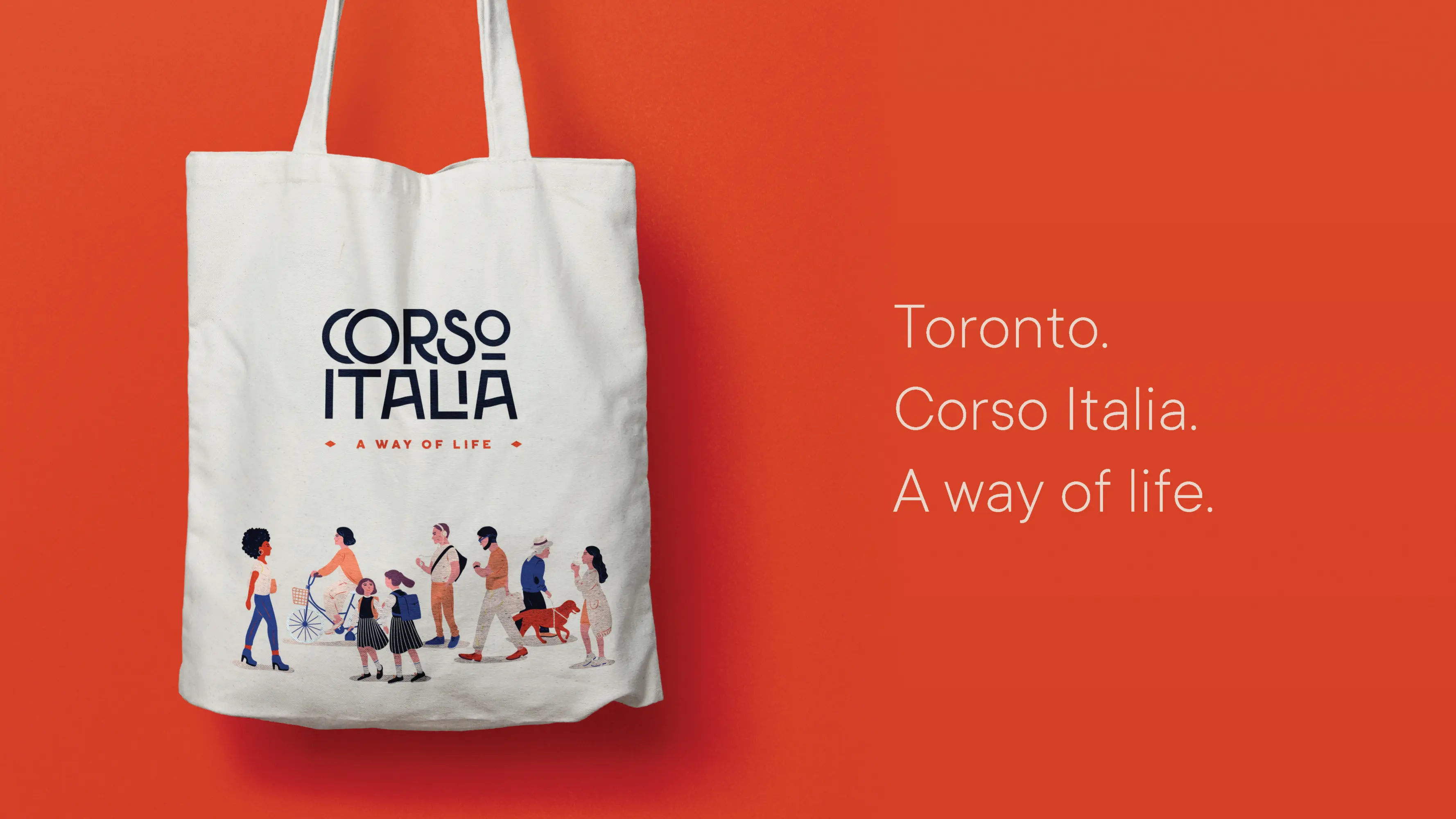
Corso Italia, a Toronto neighbourhood situated on the commercial thoroughfare St. Clair Avenue West, was ripe for rebranding. Its once dominant Italian demographic was now just one segment of a more diverse, multicultural whole. A fresh tagline: ‘A Way of Life’ was borne of the Italian “corso” (meaning “way”) to create more inclusive messaging. The visual work moved beyond traditional cultural symbolism toward a typographic-led system and human-centered illustrations. This new and vibrant identity, visible in various iterations streetside, now positions Corso Italia as a contemporary, welcoming destination for all.
The Jury‘s Statement
Repositioning an urban neighbourhood without reducing its heritage to folklore requires precise brand work. For "Corso Italia Rebrand", Dog and Pony Studios develops an identity that takes the district’s transformation seriously and frames belonging in an open way. The claim derived from the place name, a typography-led visual identity and people-centred illustrations free the communication from narrow cultural coding. Across the public realm, this creates a well-founded system that strengthens local connection and makes the location legible for different groups.