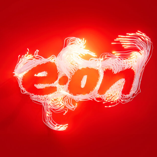
E.ON – Revamping an Iconic Brand
Best of Best
Excellent Brands
Corporate Brand of the Year
Credits
Company / Customer
Details
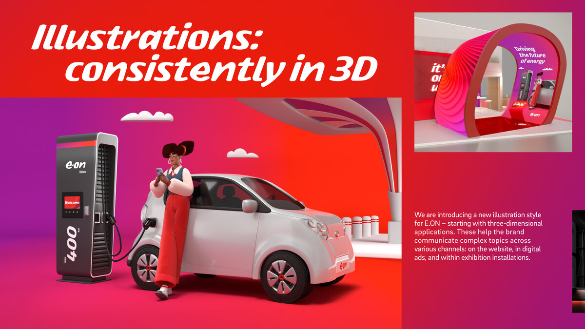
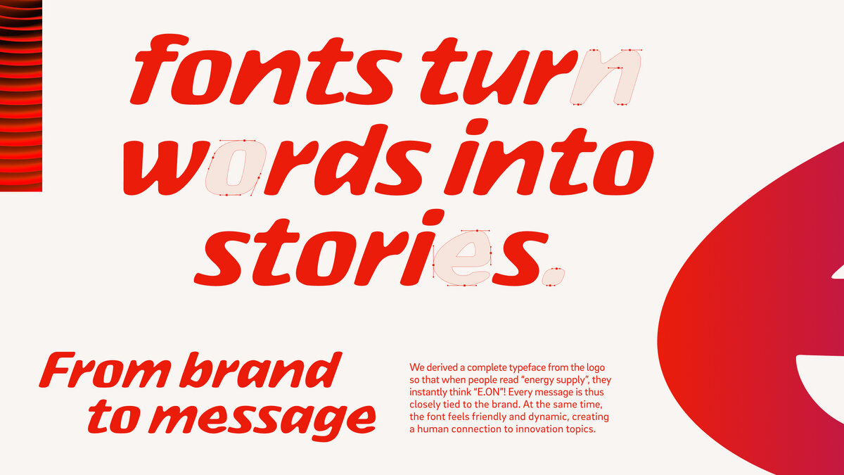
E.ON has long outgrown the role of a traditional energy supplier – today, it’s part of a new energy era. Yet the brand is still seen through an outdated lens: smokestacks, heavy industry, a past that no longer fits. It’s time to change that. With a sharpened brand positioning and a clear purpose – Making New Energy Work – E.ON is taking a stand. The new identity is stripped back and focused, built for a digital world. The iconic red takes center stage, and the logo defines every brand asset – from a custom font to illustrations and digital storytelling. Always reflecting E.ON’s role as Playmaker in the age of New Energy.
The Jury‘s Statement
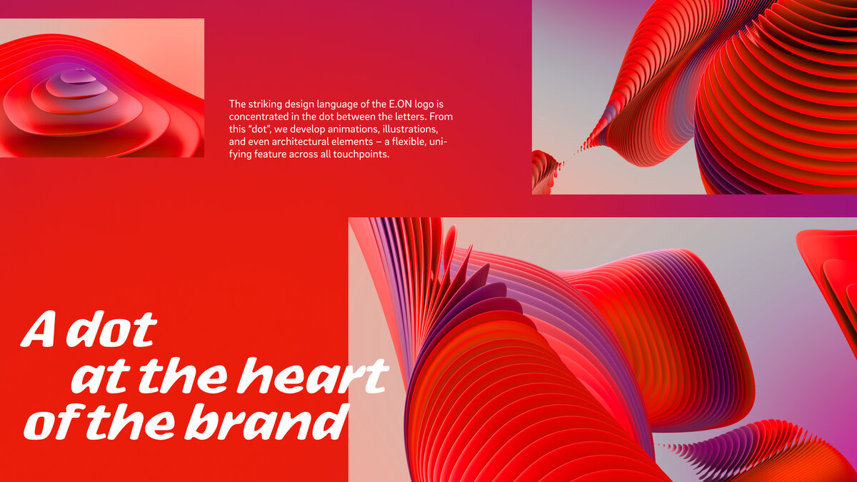
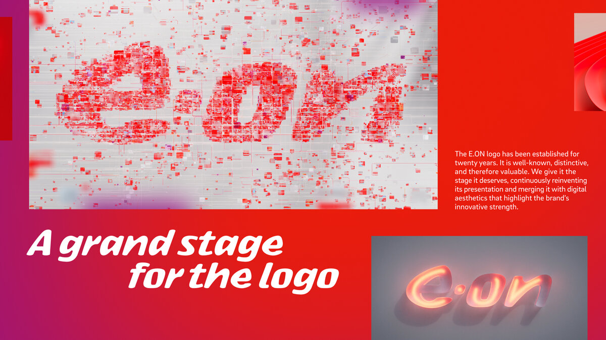
E.ON has repositioned itself as a leading player in the energy transition, delivering an impressive branding achievement. The strategic clarity is exemplified by the development of the “Playmaker-Dot,” which seamlessly integrates purpose, brand attributes, and corporate culture. Creatively, the brand relaunch excels through its focus on the iconic logo, which is strikingly showcased as the central element. Complemented by a custom-designed typeface, a distinctive corporate sound, and a characterful 3D illustration style, the result is a cohesive and contemporary brand experience. The implementation impresses with its agile approach and the use of an AI-powered generator for brand-compliant assets. This combination of strategic depth, creative precision, and technological sophistication elevates the work to an exceptional level.