E.ON – Revamping an Iconic Brand
Credits
Company / Customer
Details
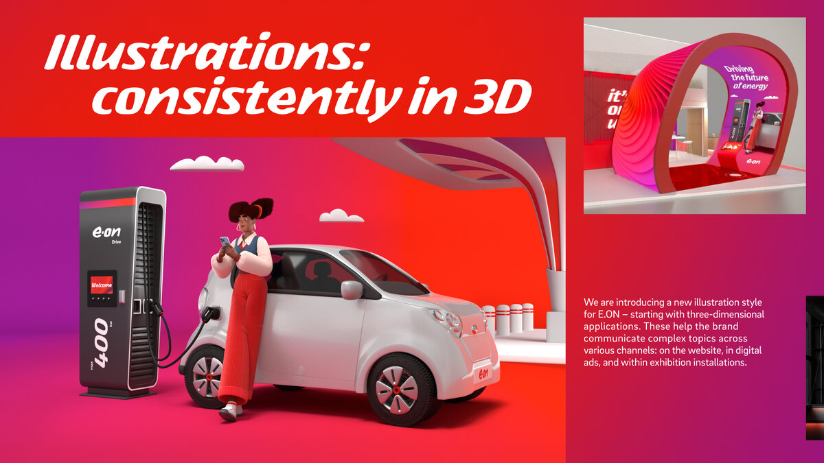
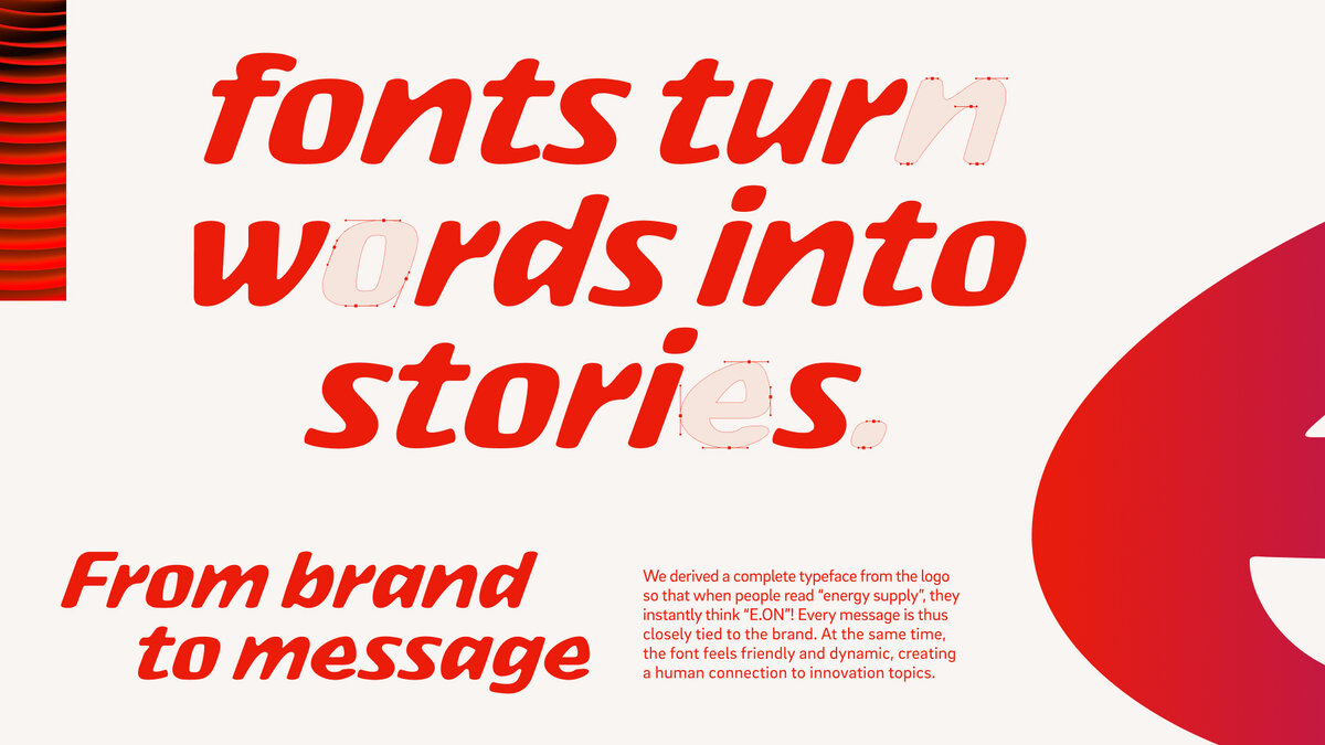
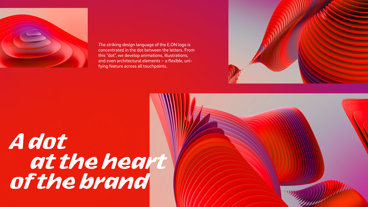
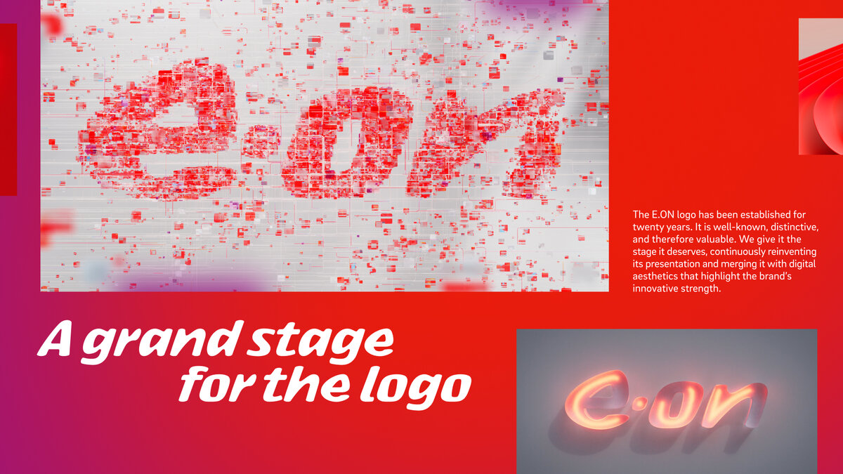
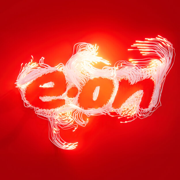
E.ON has long outgrown the role of a traditional energy supplier – today, it’s part of a new energy era. Yet the brand is still seen through an outdated lens: smokestacks, heavy industry, a past that no longer fits. It’s time to change that. With a sharpened brand positioning and a clear purpose – Making New Energy Work – E.ON is taking a stand. The new identity is stripped back and focused, built for a digital world. The iconic red takes center stage, and the logo defines every brand asset – from a custom font to illustrations and digital storytelling. Always reflecting E.ON’s role as Playmaker in the age of New Energy.