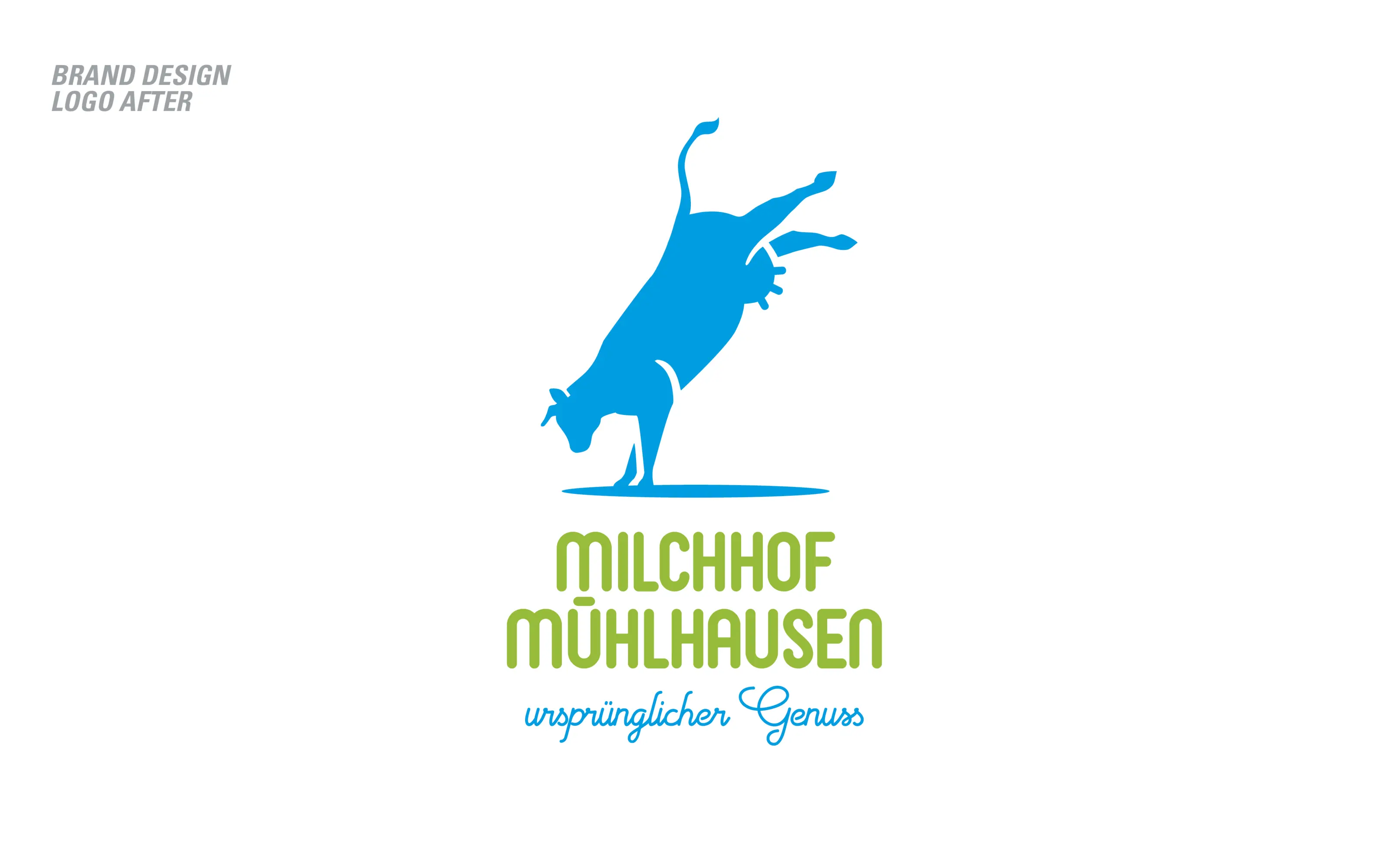
Redesign Milchhof Mühlhausen
Gold
Excellence in Brand Strategy and Creation
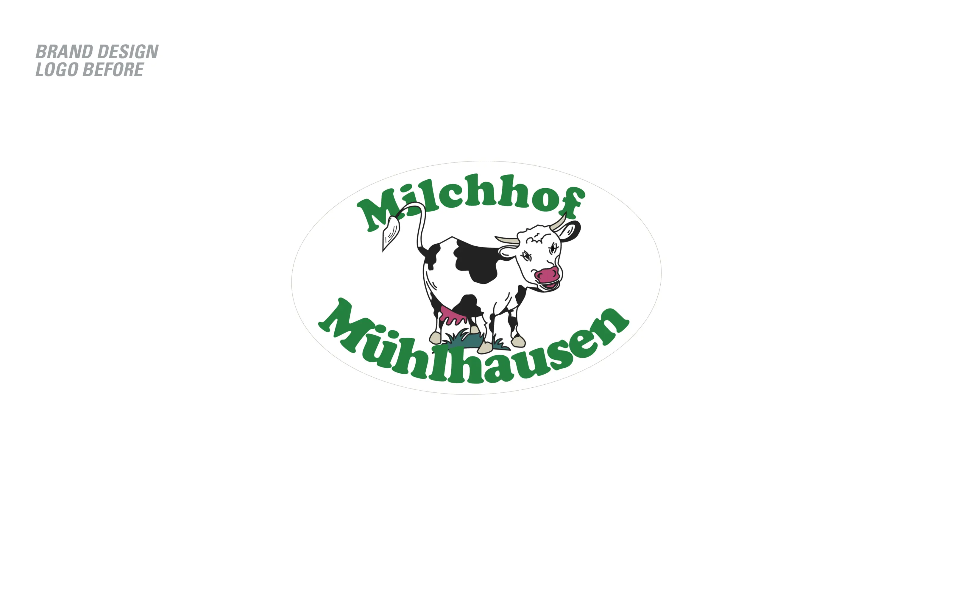
Brand Design – Logo
Credits
Company / Customer
Agency / Design
Details
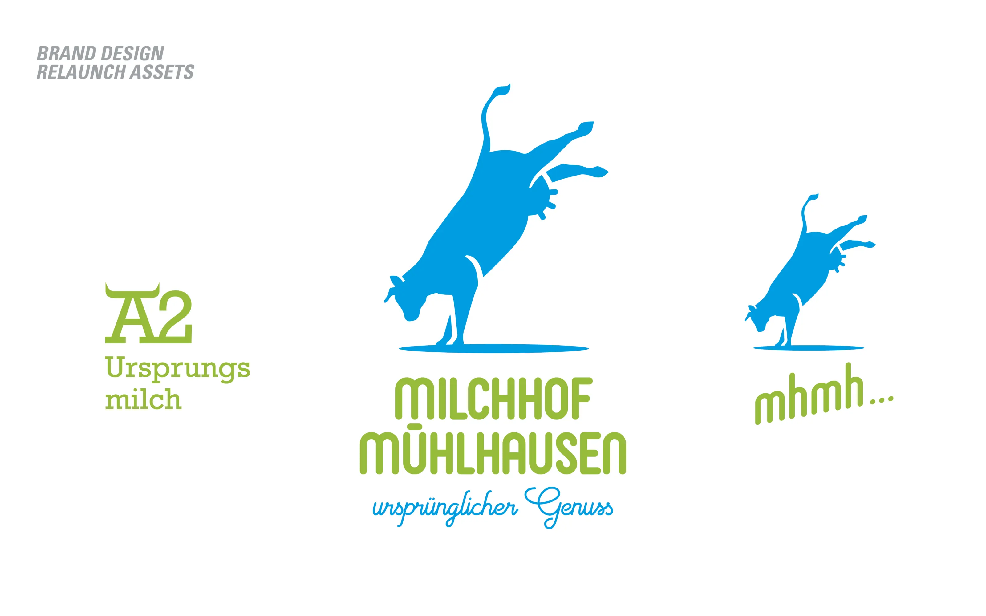
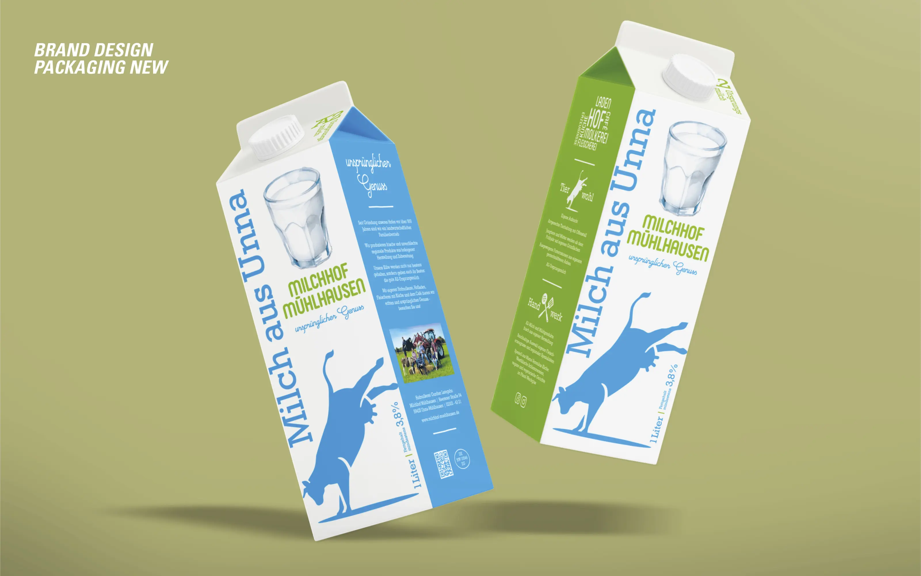
The Mühlhausen dairy farm, which is over 500 years old, offers regional food and homemade dishes based on handed down recipes for lovers of traditional farm goods. The focus is on its own dairy products made from so-called ‘A2 original milk’. The term refers to the original state of cow’s milk, which is now rarely found due to selective breeding and is considered easier to digest. The logo redesign retains the motif of a cow but now focuses on the brand essence. Thereby giving the dairy identity, form and purpose. The claim ‘Ursprünglicher Genuss’ means ‘Enjoyment in its original form’ - a Logo not yet seen in this category.
The Jury‘s Statement
In a category full of interchangeable cow motifs, Creative Directions starts with the actual brand idea for Milchhof Mühlhausen. The new mark retains the familiar image, yet condenses it into the notion of the original and thus gives the brand a precise conceptual direction. The form is reduced, lively and clearly legible in both small and large applications. The logo gains its relevance by bringing together tradition, generational change and the positioning around A2 original milk within a single sign.