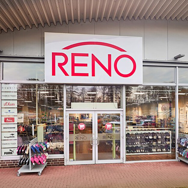
Rebranding RENO (Kienast Unternehmensgruppe)
Winner
Excellence in Brand Strategy and Creation
Brand Design – Corporate Brand
Details
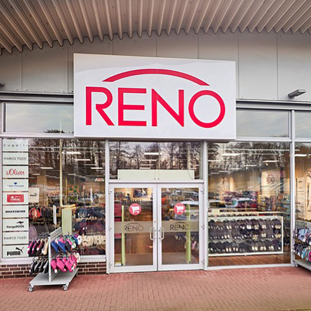
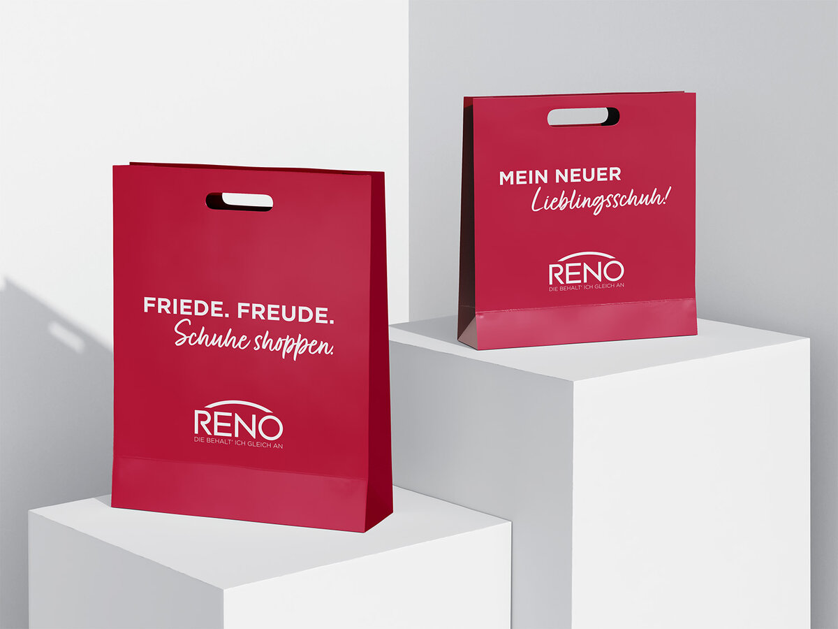
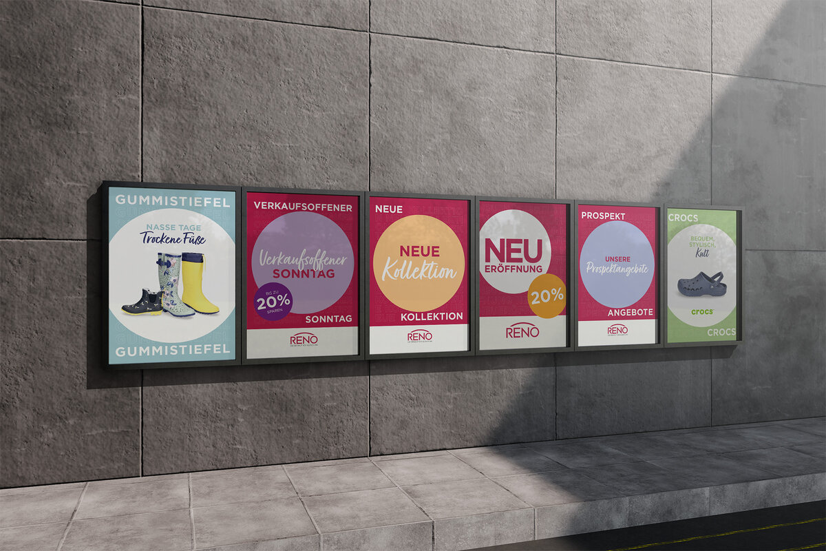
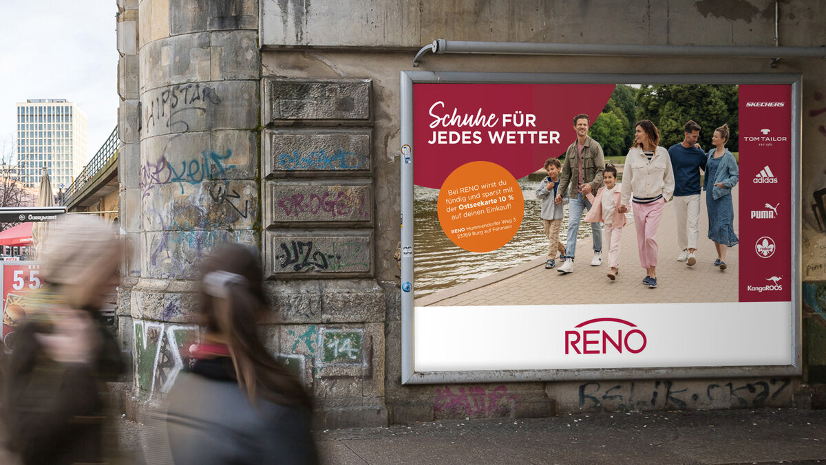
Rebranding of the RENO Brand. The RENO brand signet, consisting of the logo and the claim “Die behalt’ ich gleich an” (“I’ll keep these on right away”), has been refreshed to make it more contemporary. As part of the “revitalization” of this well-known brand, a new corporate design manual has been developed. Proven elements have been retained, outdated styles, fonts, and guidelines have been replaced with new typography and a clearer design language. This has enabled the creation of campaigns, advertising materials, and point-of-sale communication measures that reinforce the RENO brand image by appearing approachable, friendly, and vibrant.
The Jury‘s Statement
The rebranding of “RENO” demonstrates how a long-established brand can be successfully repositioned. With a contemporary corporate design that preserves and thoughtfully evolves familiar elements, it effectively communicates the brand’s core in a clear and concise way. The unified visual language and modern typography provide a consistent foundation for all communication initiatives. Particularly noteworthy is the strategic approach, which reinforces brand recognition and harmoniously addresses diverse target groups. A remarkable example of impactful brand work.