New Blanco Identity
Winner
Excellence in Brand Strategy and Creation
Brand Design – Corporate Brand

Credits
Company / Customer
Agency / Design
Details
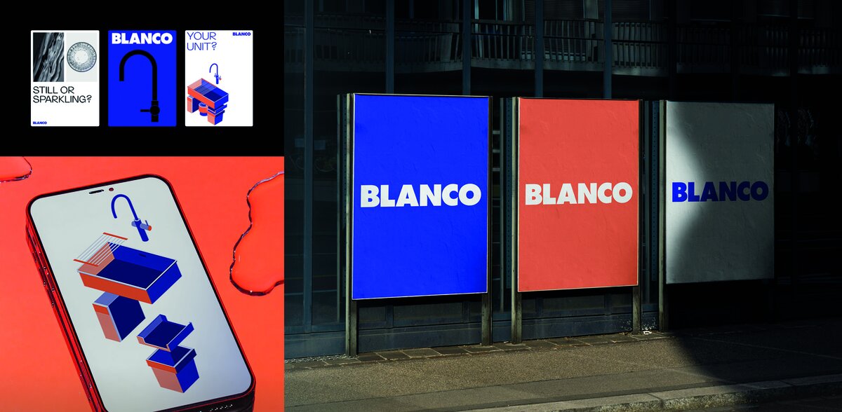
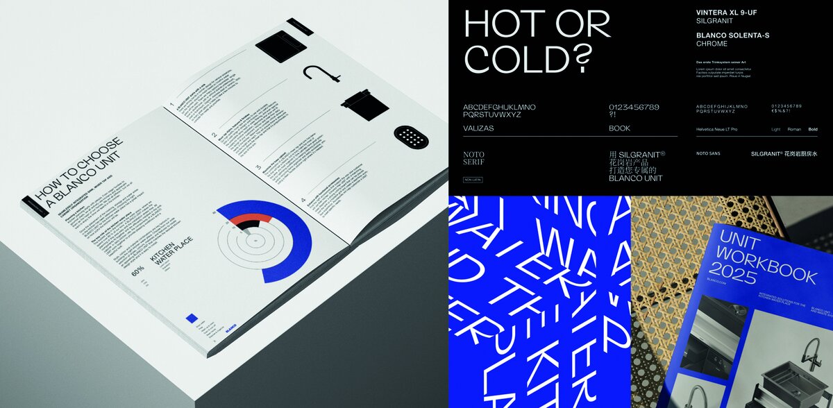
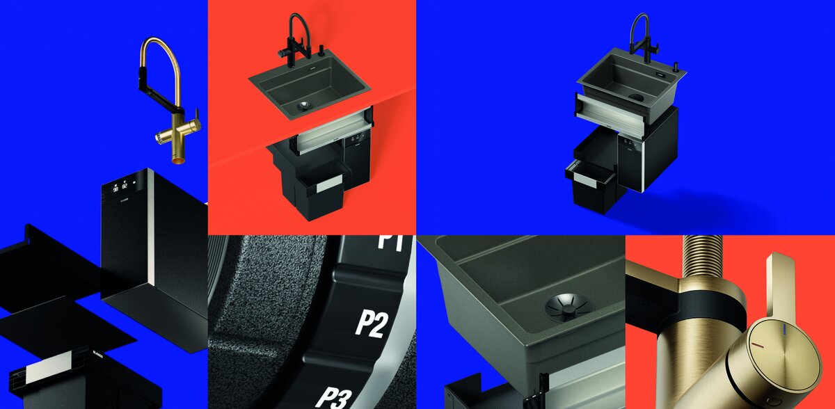
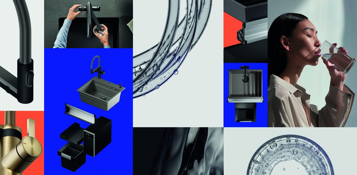
BLANCO presents its completely revised brand identity. For BLANCO's 100th anniversary, the kitchen water place specialist highlights its claim to enhance the central place in the kitchen, both functionally and aesthetically. At the same time, BLANCO's external image clearly sets it apart from the competition. Key elements of the new brand identity include distinctive colour schemes, expressive fonts and modern, pared-back imagery that places the kitchen water place in the foreground. The characteristic BLANCO logo remains unchanged.
The Jury‘s Statement
BLANCO, a specialist in kitchen water hubs, marks its 100th anniversary with a fully revamped brand identity. By focusing sharply on the central workspace in the kitchen, the brand successfully distinguishes itself from the competition. The harmonious combination of reduced design elements, striking typography, and minimalist imagery underscores BLANCO's premium positioning. The bold color palette and contemporary visualizations create a brand experience that is both aesthetically and functionally compelling, leaving a lasting emotional and strategic impact.