GEWAG – Design-Transformation: Der Relaunch einer Wohnungsmarke
Winner
Excellence in Brand Strategy and Creation
Brand Design – Corporate Brand

Credits
Company / Customer
Agency / Design
Details
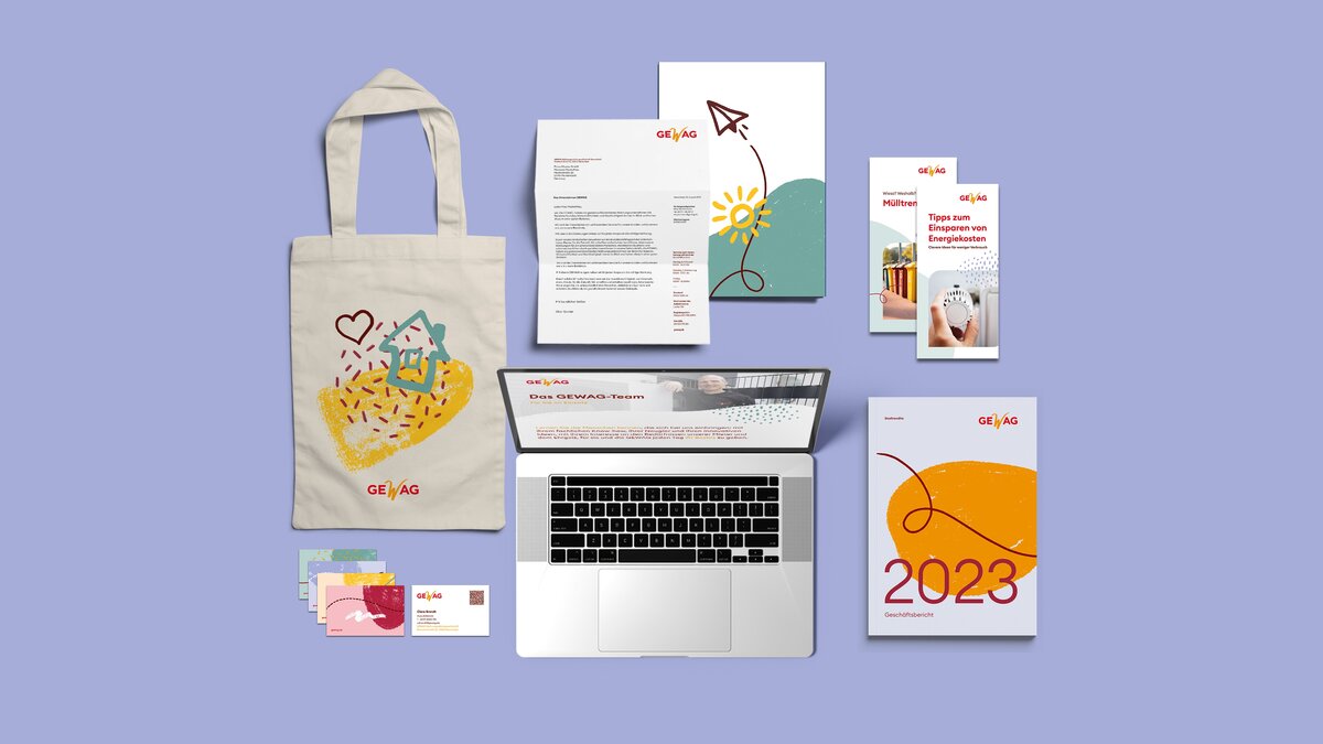
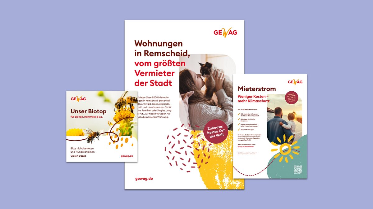
GEWAG, the largest housing provider in the Remscheid region with over 6,000 apartments, is committed to affordable and high-quality living, climate protection, and sustainable neighbourhood development. 31M redesigned the corporate identity to unite tradition and modernity in a strong brand presence. The logo was refined for greater impact, while an expanded colour palette, contemporary typography, and new graphic elements modernize the appearance. Vibrant illustrations inspired by the "W" in the GEWAG logo bring dynamism and brand recognition. The relaunch positions GEWAG as a modern, approachable, and future-oriented housing provider.
The Jury‘s Statement
GEWAG represents affordable housing, climate protection, and social responsibility in Remscheid. The revamped corporate design successfully unites tradition with a forward-looking vision. Distinctive logo applications, an expanded color palette, and dynamic design elements create a versatile and recognizable identity. Particularly noteworthy is the modern, intuitively designed website, seamlessly connecting digital and physical touchpoints. The new brand appearance positions GEWAG as an approachable, future-oriented provider and sets standards through its consistent visual strategy.