E.ON – Revamping an Iconic Brand
Gold
Excellence in Brand Strategy and Creation
Brand Design – Corporate Brand

Credits
Company / Customer
Details
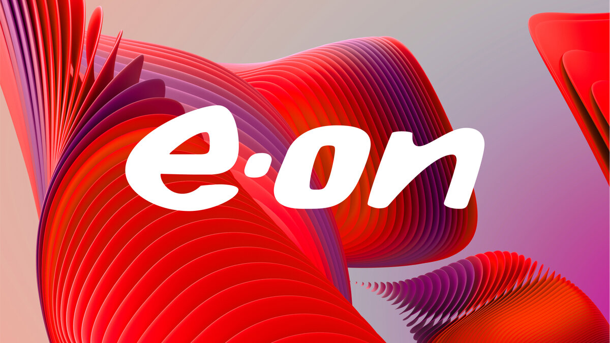
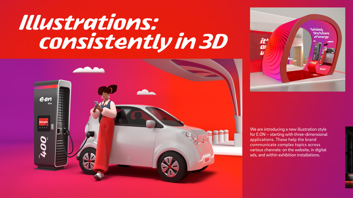
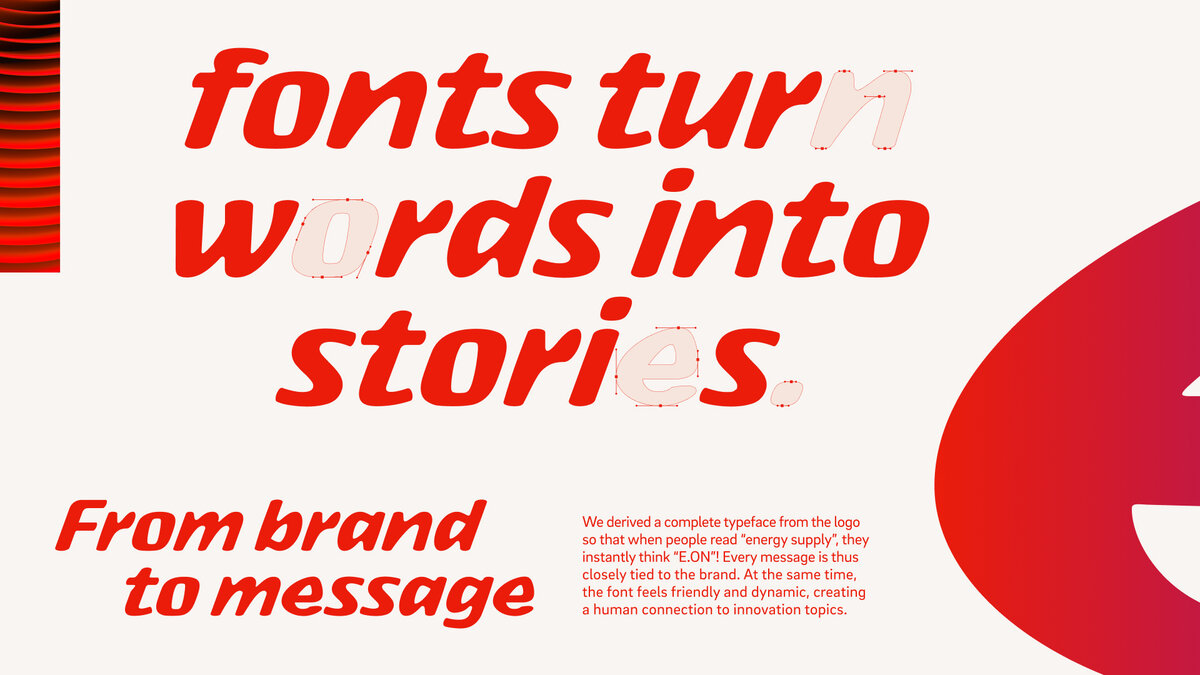
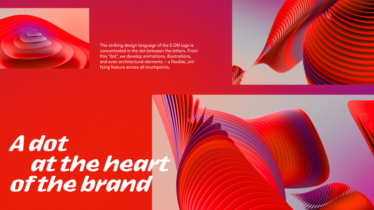
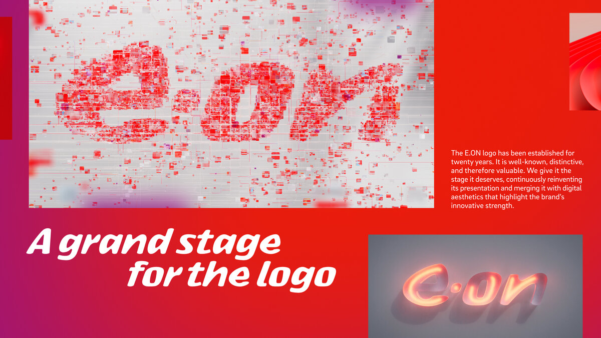
E.ON wants to drive the energy transition forward with sustainable solutions – but there’s a challenge: most people still associate the company with coal power plants. To reposition the brand, we strip away the unnecessary and amplify what truly defines it. We give red more presence, place the iconic logo at the heart of the identity, and build all other assets around it: a new corporate typeface, 3D illustrations, innovative digital experiences, and architectural design. All within just three months. Plus, a distinctive corporate sound to complete the brand’s new identity.
The Jury‘s Statement
E.ON presents itself as a driving force in the energy transition with a comprehensive brand relaunch. With a clear strategic focus on sustainability, the visual identity has been thoroughly reimagined: the iconic logo takes center stage, framed by a striking red and a custom-designed corporate typeface. Complemented by 3D illustrations, a distinctive corporate sound, and an AI-powered asset generator, the result is a brand experience that is both cohesive and versatile. This approach combines strategic clarity with design precision, transforming the perception of the brand in a lasting way. An impressive example of the powerful connection between brand strategy, design, and communication.