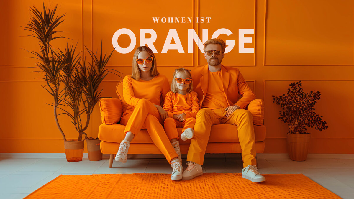
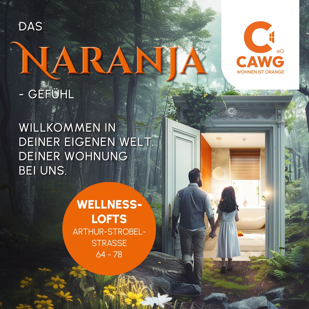
CAWG - Wohnen ist orange
Winner
Excellence in Brand Strategy and Creation
Brand Design – Corporate Brand

Details
With the new corporate design we visually transformed the brand of the CAWG housing cooperative: A fresh logo, modern typography and the consistent use of the signal color orange created a visual bracket for all measures, e.g. facade design (a timeline connects past and future), member magazine “Orangenpresse”, multi-channel campaign (“Blockbuster Events”, CampusZimmer and lots more), brand experience (emotionally charged events and innovative communication tools). With the help of our innovative ideas and boosted by our strategic implementation, CAWG was successfully positioned as a modern housing provider.
The Jury‘s Statement
The Chemnitzer Allgemeine Wohnungsbaugenossenschaft has achieved an impressive transformation with its new corporate design. Through a distinctive visual concept featuring a clear logo, modern typography, and the signal color orange, it masterfully bridges tradition and future. Particularly noteworthy is the consistent implementation, spanning from façade design to emotionally charged brand experiences. The project impresses with strategic precision, visual consistency, and a strong sense of identity, positioning the brand as a modern housing provider.