NWL
Winner
Excellent Brands
Transport and Mobility
Credits
Company / Customer
Agency / Design
Details
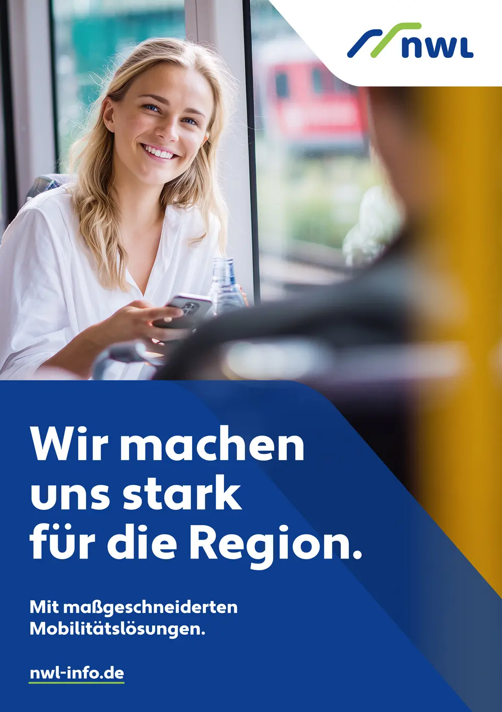
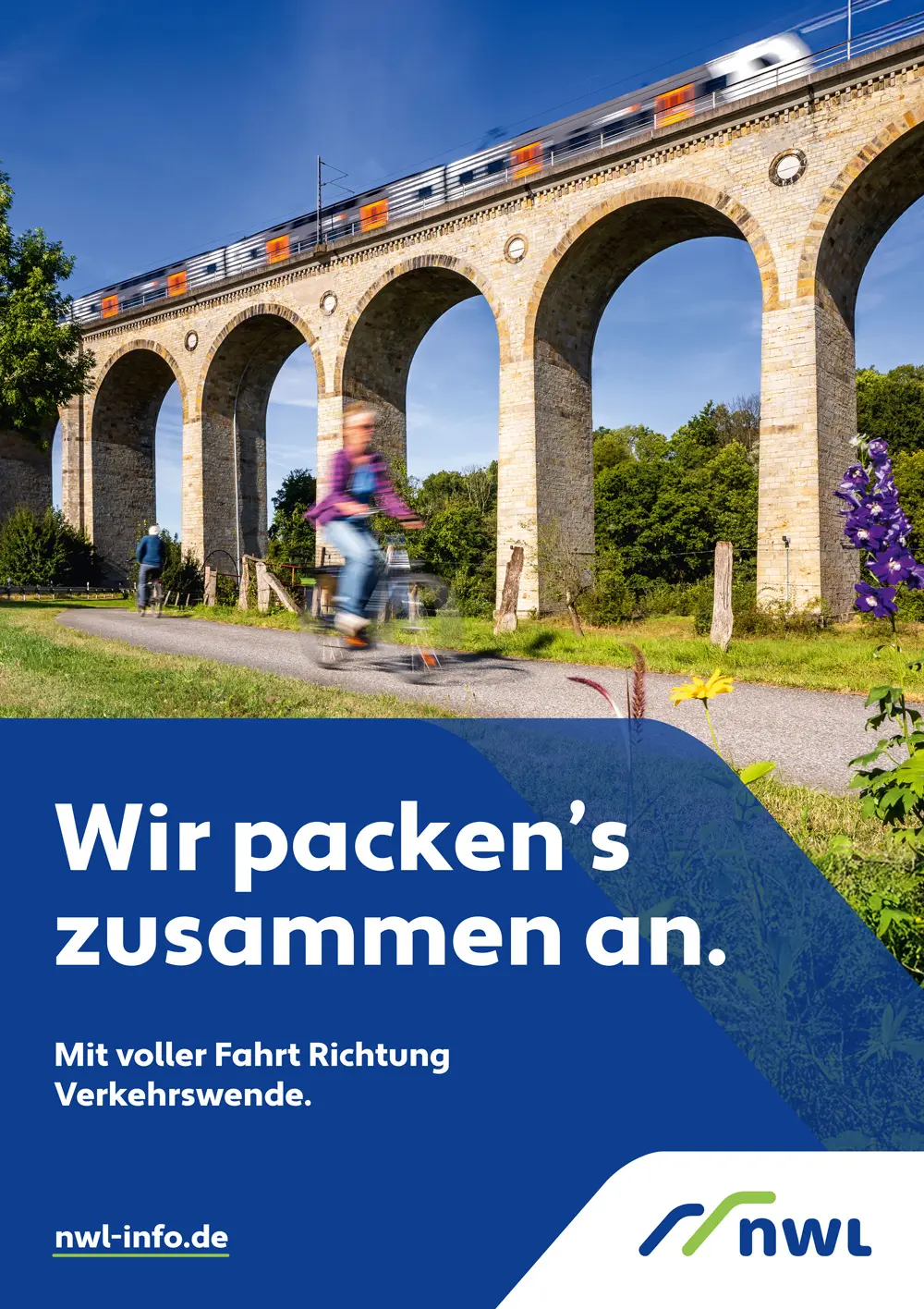
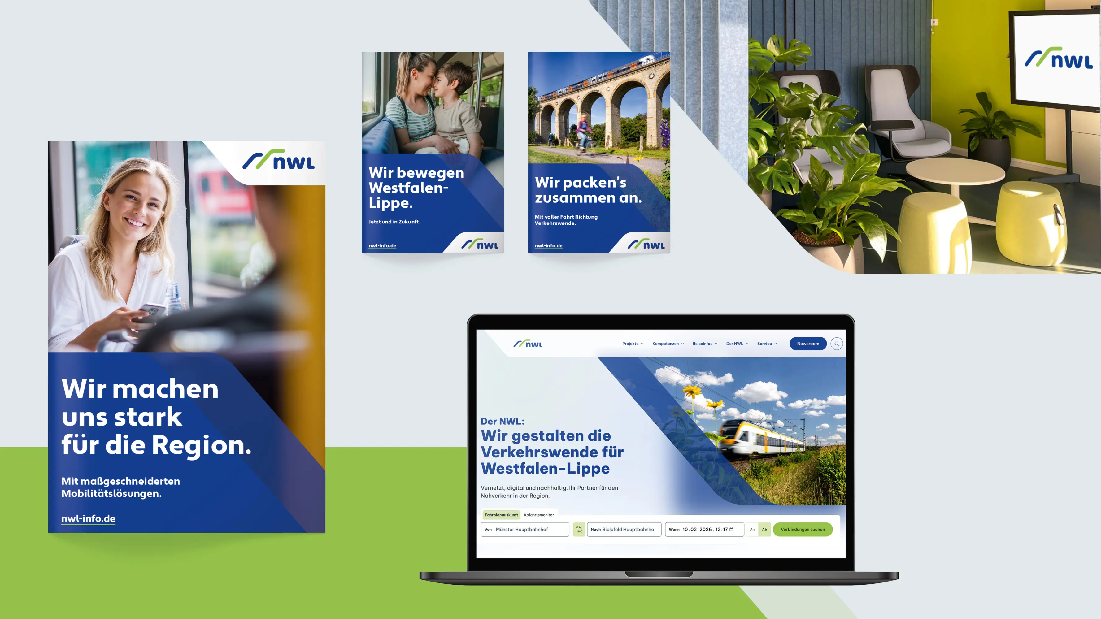
NWL – Rethinking Mobility In challenging times for public transport, NWL is evolving from administrator to active shaper of mobility. A strategic rebrand replaces bureaucratic restraint with clarity and transparency. Bold design, strong typography and striking colours make public responsibility visible and appealing, supporting the mobility transition. The new identity is being rolled out step by step, making mobility as an essential public service more tangible and demonstrating the impact of strategic design in the public realm.
The Jury‘s Statement
Where responsibilities, fare structures and political accountability in local transport often remain difficult to read, NWL adopts a clear brand repositioning. The rebrand gives an explanatory and coordinating body a precise profile that creates orientation without feeling official. Typography, colour contrasts and hierarchies are designed for legibility in public space and implemented cleanly across digital and analogue touchpoints. The result is a brand that does not merely claim trust, but builds it through clarity and reliability.