BR Motiondesign
Winner
Excellence in Brand Strategy and Creation
Brand Experience of the Year
Details
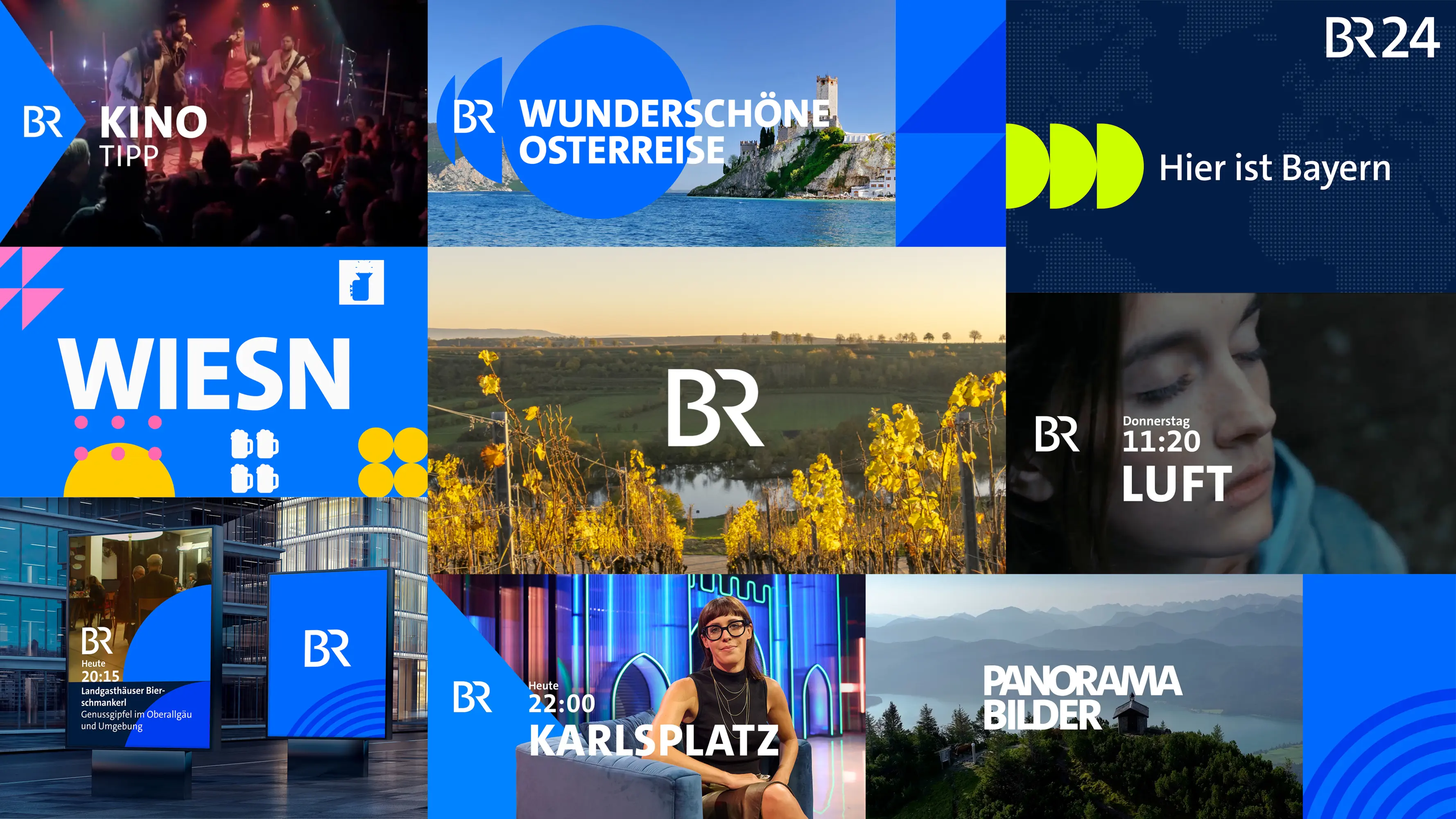
Bayerischer Rundfunk’s new motion design has proven to be a further step towards a unified look and a clear visual brand identity. Deduced from the specific form elements constituting the BR logo, the consistent use of circles, squares and triangles characterises the design vocabulary: It is the brand Bayerischer Rundfunk which is given top priority. The standardised character font as well as a distinctive animation concept guarantee visual recognisability, which links the programmes of Bayerischer Rundfunk even further, thereby ensuring they are clearly recognisable as parts of one joint brand family.
The Jury‘s Statement
For Bayerischer Rundfunk, unifying its moving image presence was a central brand task. "BR Motiondesign" addresses this with a clearly defined visual system of circles, squares and triangles that creates orientation across linear and non-linear channels. A uniform typeface, a distinctive animation principle and a contemporary colour palette make the brand immediately identifiable at the moment of use. What stands out is how design discipline creates a coherent brand experience across very different distribution channels.