BR Motiondesign
Winner
Excellence in Brand Strategy and Creation
Brand Design – Product Brand
Details
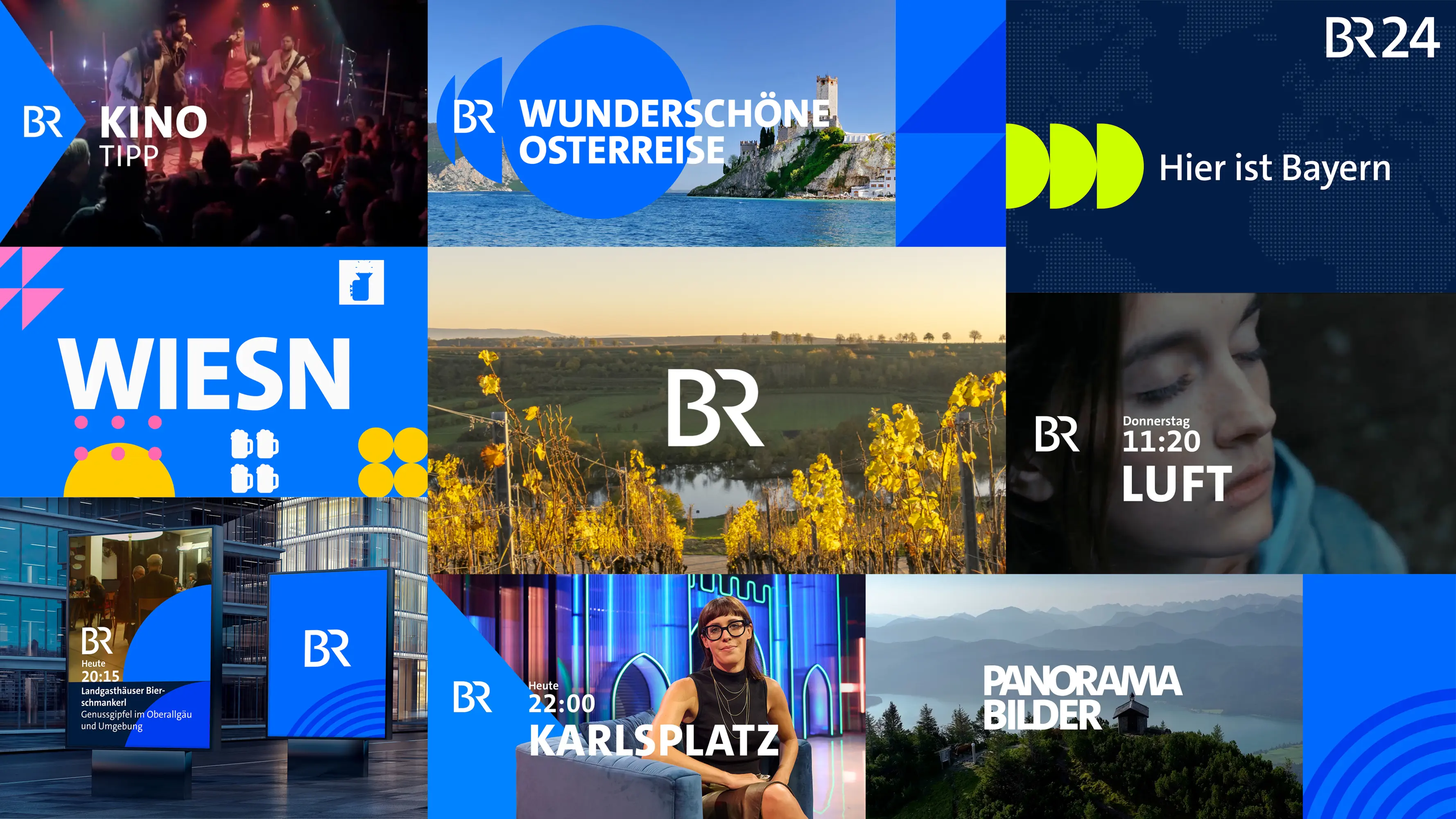
Bayerischer Rundfunk’s new motion design has proven to be a further step towards a unified look and a clear visual brand identity. Deduced from the specific form elements constituting the BR logo, the consistent use of circles, squares and triangles characterises the design vocabulary: It is the brand Bayerischer Rundfunk which is given top priority. The standardised character font as well as a distinctive animation concept guarantee visual recognisability, which links the programmes of Bayerischer Rundfunk even further, thereby ensuring they are clearly recognisable as parts of one joint brand family.
The Jury‘s Statement
In moving image, a media brand needs orientation across many channels and formats. Bayerischer Rundfunk addresses this task with a motion design that brings the brand together visibly: a clear visual language of circle, square and triangle, a contemporary colour palette, a consistent typeface and a distinctive animation principle create a robust system for linear and non-linear applications. What stands out is the consistency with which individual design elements are turned into a shared visual sender logic.