Metabo Rebranding
Winner
Excellence in Brand Strategy and Creation
Brand Design – Corporate Brand
Credits
Company / Customer
Details
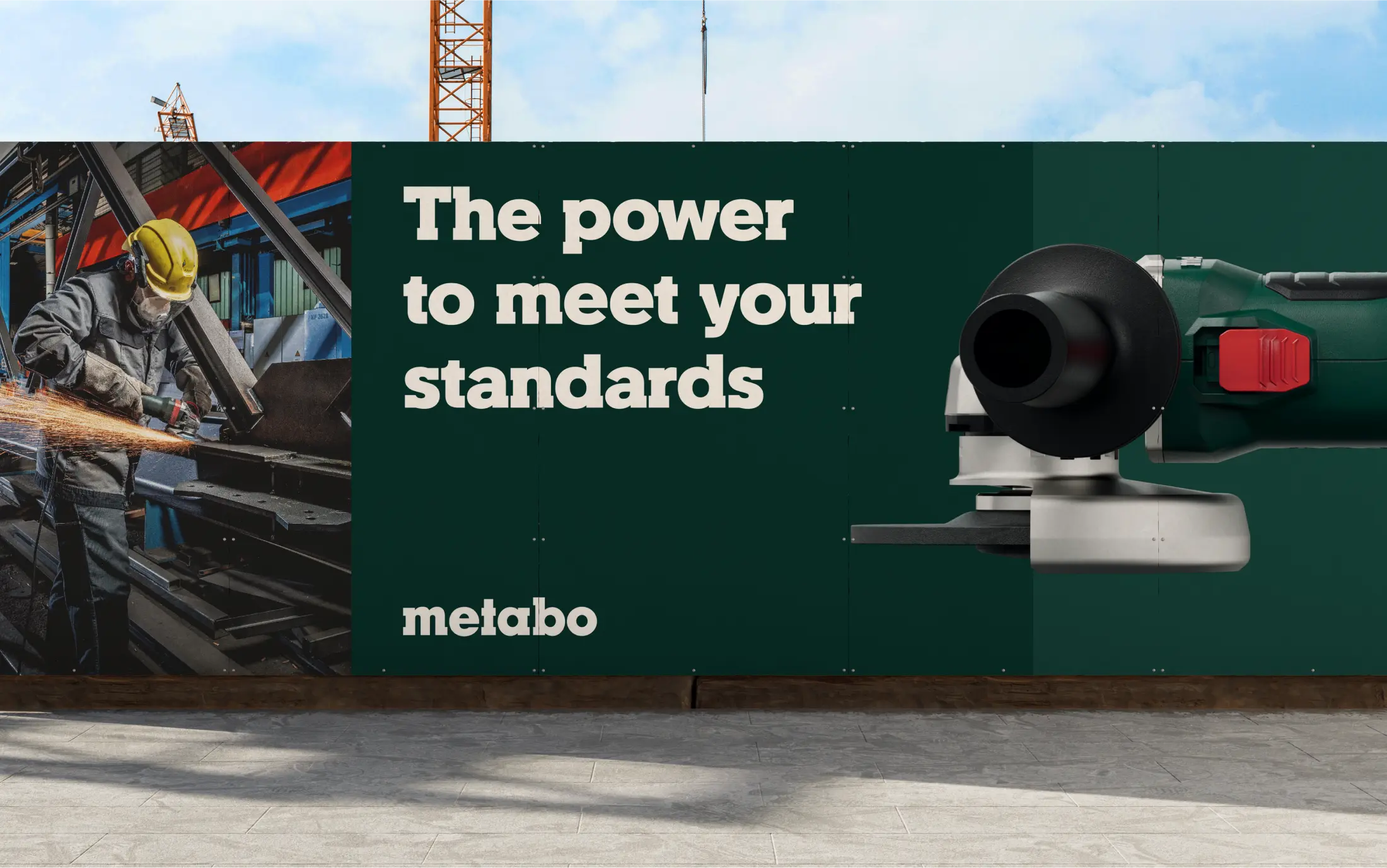
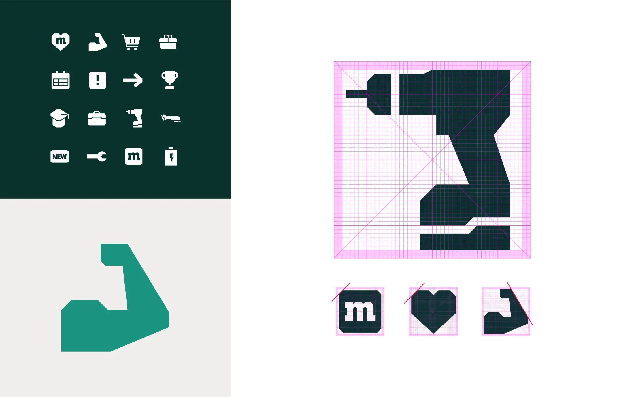
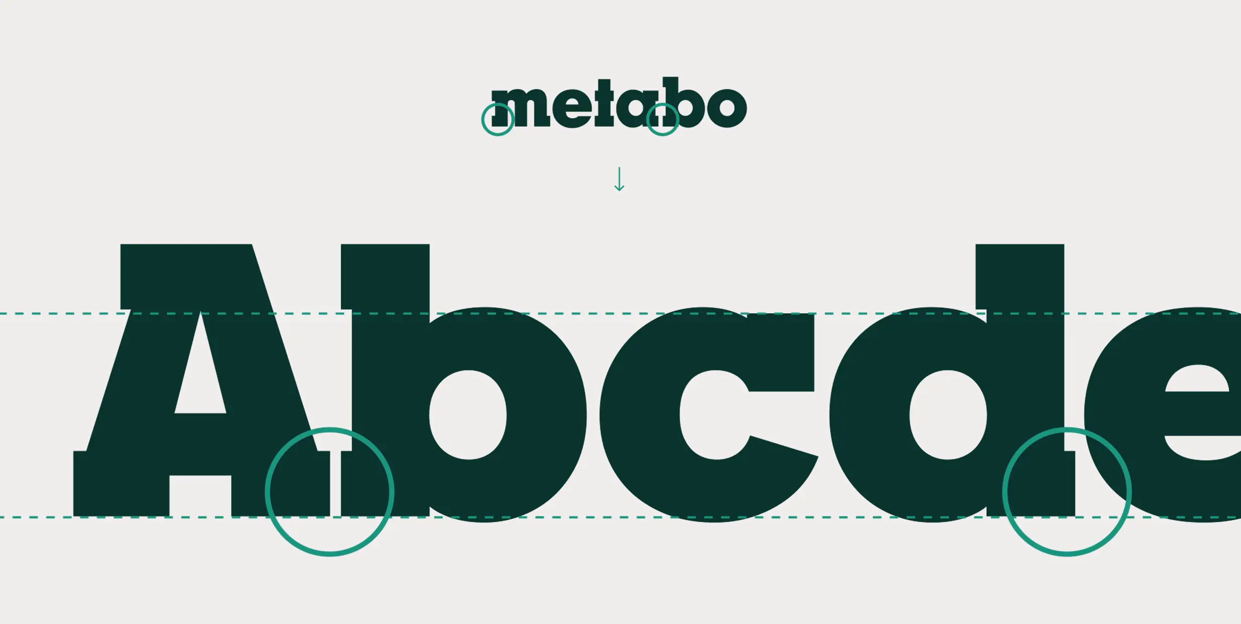
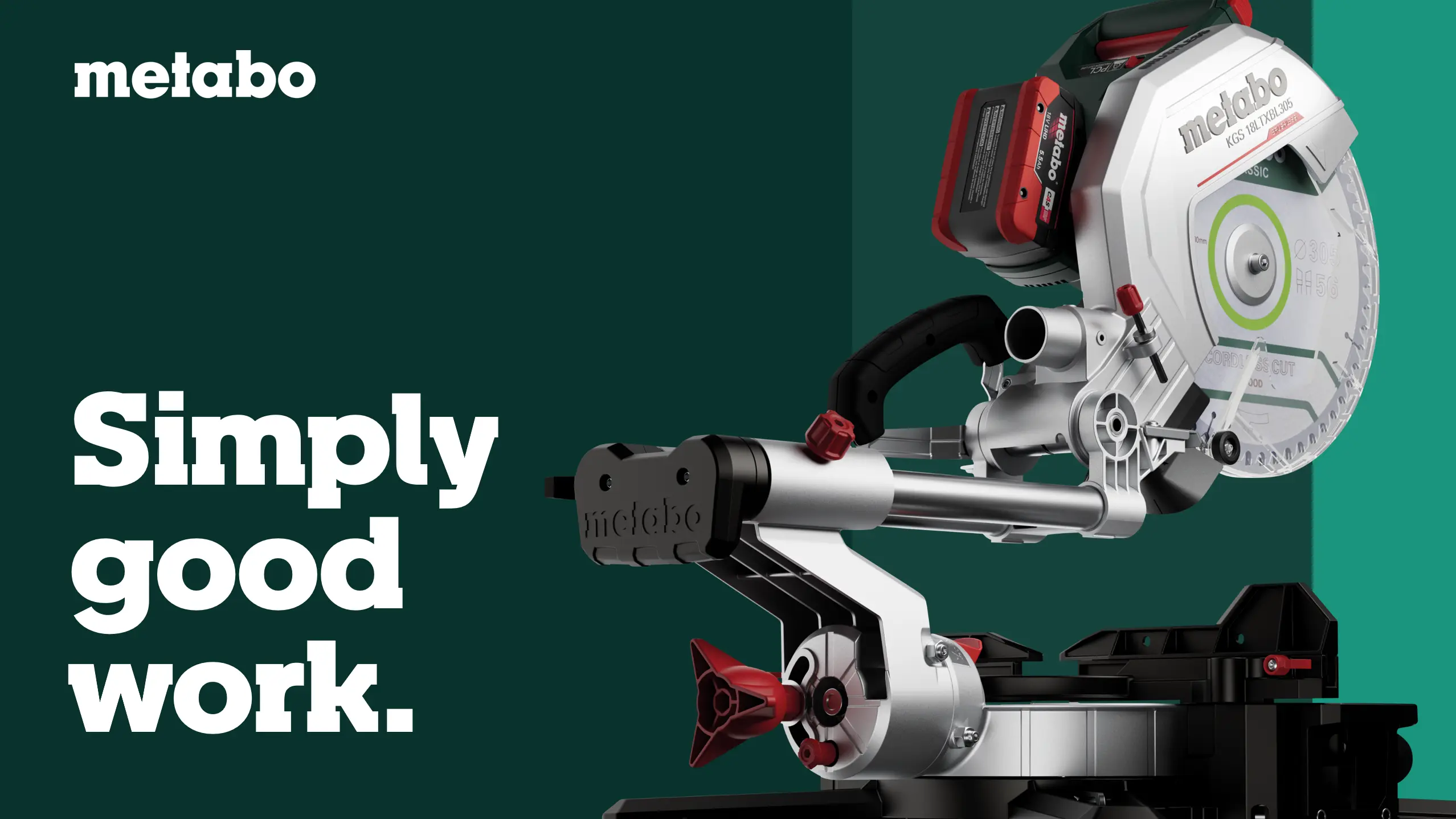
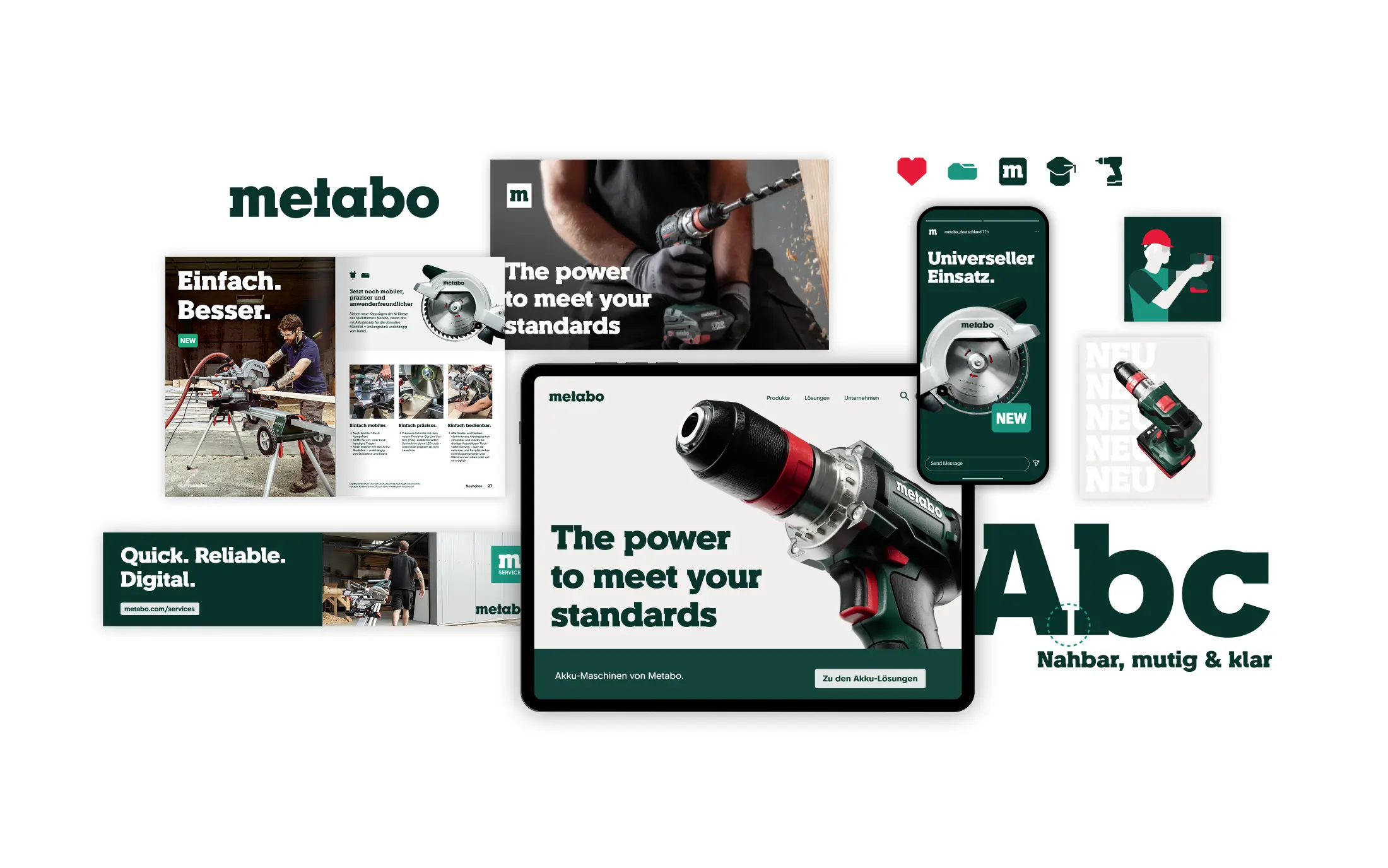
For more than 100 years, Metabo has been supporting craftspeople and industry with professional power tools and services. The goal was to carry the brand and its values into the future, strengthen the bond with Metabo fans, and at the same time engage a younger generation of tradespeople. The relaunch focuses on a bold evolution of established design elements. The distinctive logo and the dark green color remain. Building on this foundation, a new color system, a characteristic customized typography, a clear iconography and labeling system, and a modular design concept enable a flexible and striking brand presentation.
The Jury‘s Statement
This relaunch addressed a heritage brand whose design had lost profile and was no longer reaching younger target groups effectively. The relaunch of Metabo consistently evolves familiar brand elements rather than replacing them: the logo and dark green remain, while typography, colour system, iconography and labels are reorganised. This creates a modular corporate design that can be deployed flexibly across international markets and gives the brand a clear, contemporary identity across all touchpoints once again.