JOST Brand Refresh
Winner
Excellence in Brand Strategy and Creation
Brand Design – Corporate Brand

Details
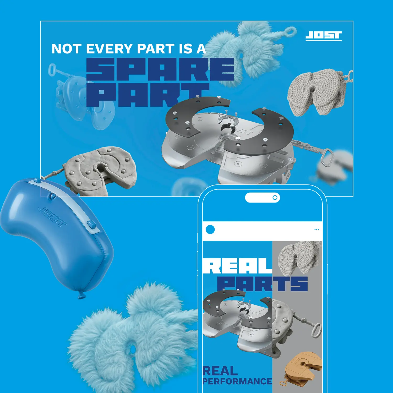
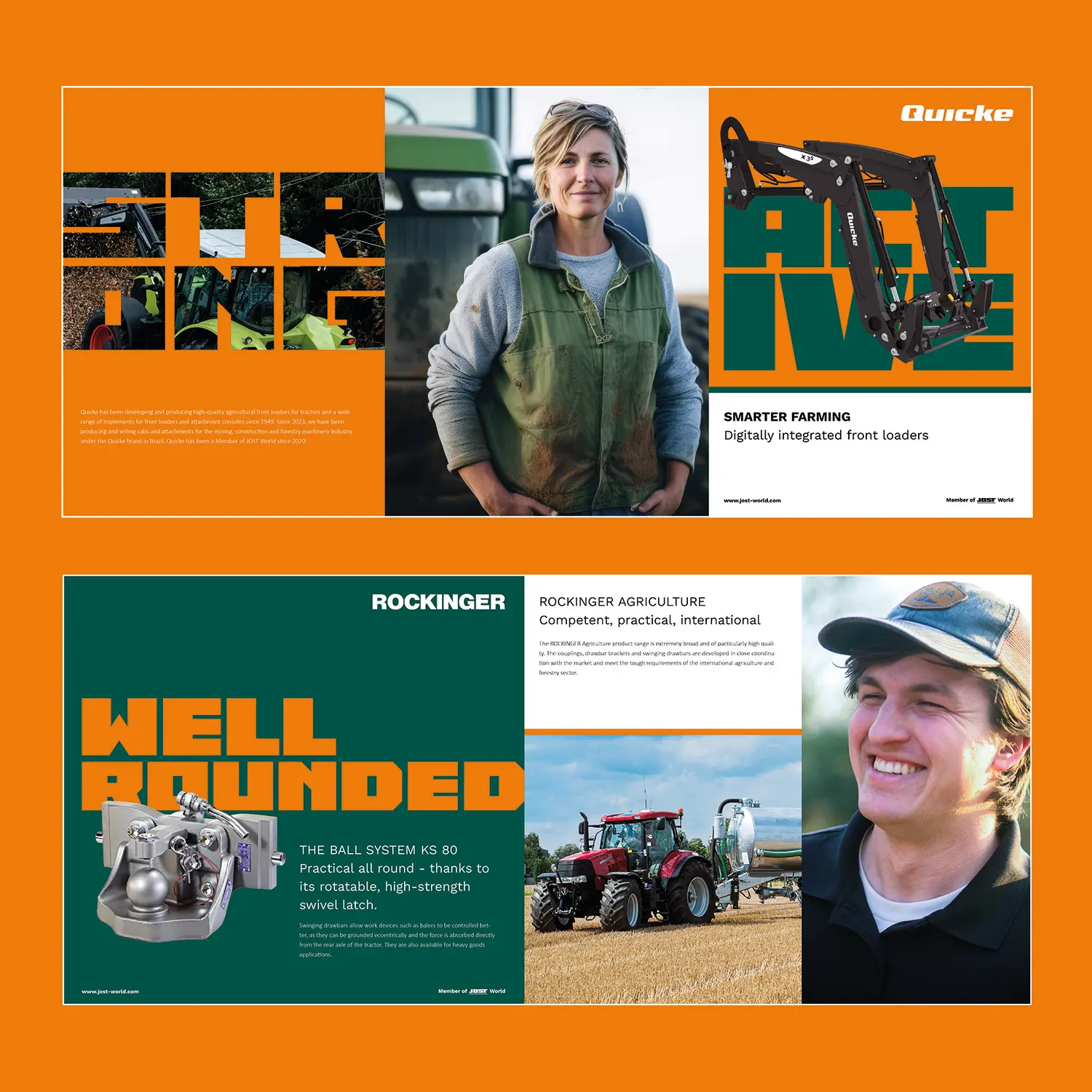
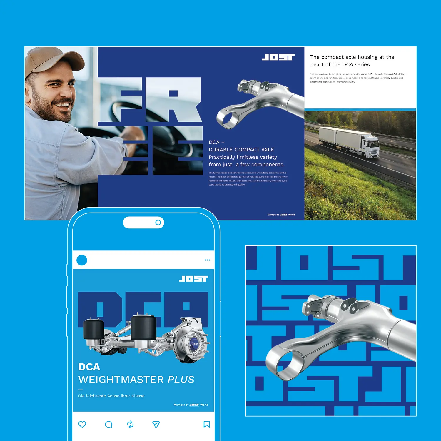
The JOST brand refresh translates 75 years of technical excellence into a modern identity, sharpening the profile of the commercial vehicle systems supplier. As a thought leader and 'love brand,' JOST engages its audiences through distinctive design. Under the core theme 'BOLD IS BEAUTIFUL,' our new look combines courage with substance—featuring a striking signet, bold typography, and human-centric imagery. We bridge tradition and the future by focusing on digital innovation and sustainable development. This evolution from hidden champion to visible industry pioneer is already delivering measurable results: the new brand identity is hitting the mark.
The Jury‘s Statement
From a technically strong brand that had little profile in the market, the "JOST Brand Refresh" creates a clearly managed corporate brand. The strategic set-up is particularly precise: thought leadership, emotional resonance and connectedness are not merely claimed, but addressed in differentiated ways through the signet, a proprietary typeface, the colour palette and a human-centred visual world. The fact that the stylised J functions both as the core product and as the connecting sign of the brand architecture anchors design and positioning in a well-founded idea.