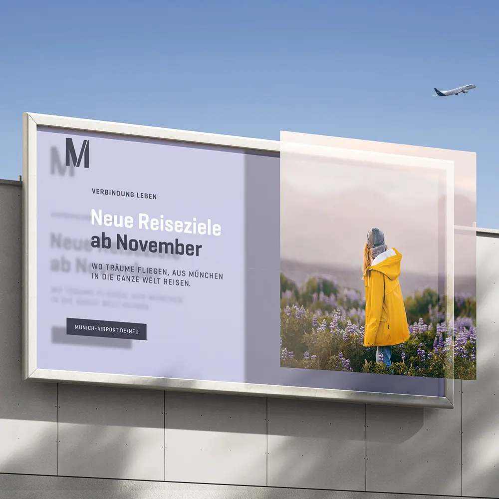
Corporate Re-Design Flughafen München
Winner
Excellence in Brand Strategy and Creation
Brand Design – Corporate Brand
Details
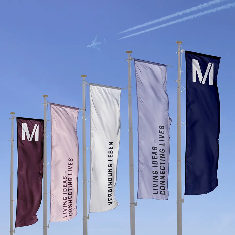
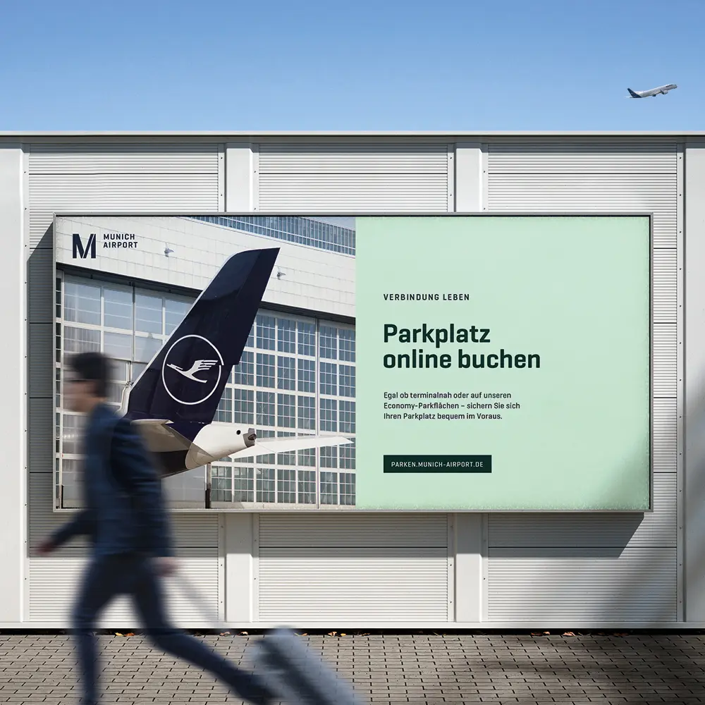
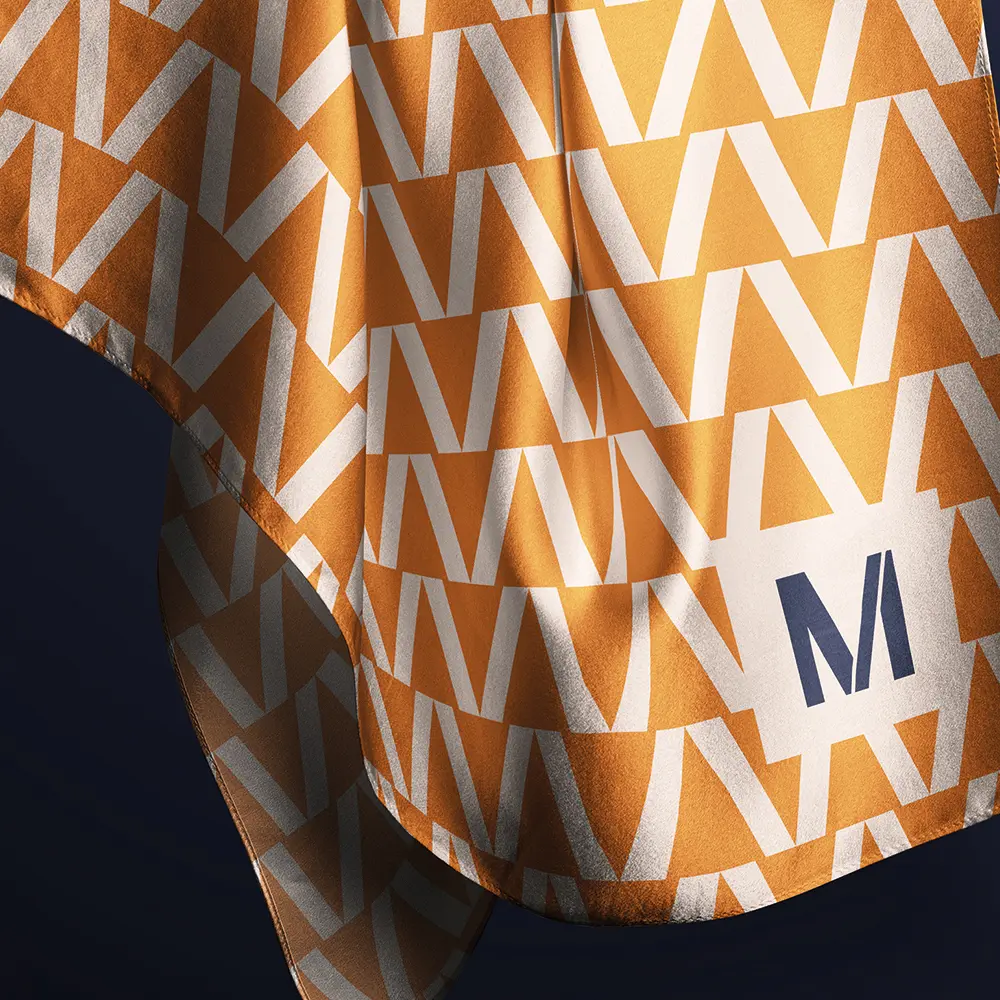
Munich Airport is preparing its brand for modern media and rising sustainability requirements without losing its core identity. The new visual identity strengthens its position as an international premium hub by improving orientation, simplifying communication, and enabling a more consistent brand experience. A modular system ensures clarity and flexibility across all touchpoints. Modern colours, a clear visual language, and a flexible pattern combine with the “M” to create a distinctive Munich experience.
The Jury‘s Statement
Where long-established visual identities often lose clarity across digital and analogue applications, Munich Airport opts for precise evolution rather than rupture. The new corporate design reorganises the brand through a modular system that clearly separates fixed and flexible elements and makes them reliably usable across all touchpoints. The distinctive M, a reduced visual language and typography designed for use across media provide orientation without abandoning the established identity. This results in a brand presence that brings together international ambition, regional rootedness and contemporary usability in a robust form.