BIB Fair Banking – Markenrelaunch mit Klarheit und Verantwortung
Winner
Excellence in Brand Strategy and Creation
Brand Design – Corporate Brand

Credits
Company / Customer
Agency / Design
Details
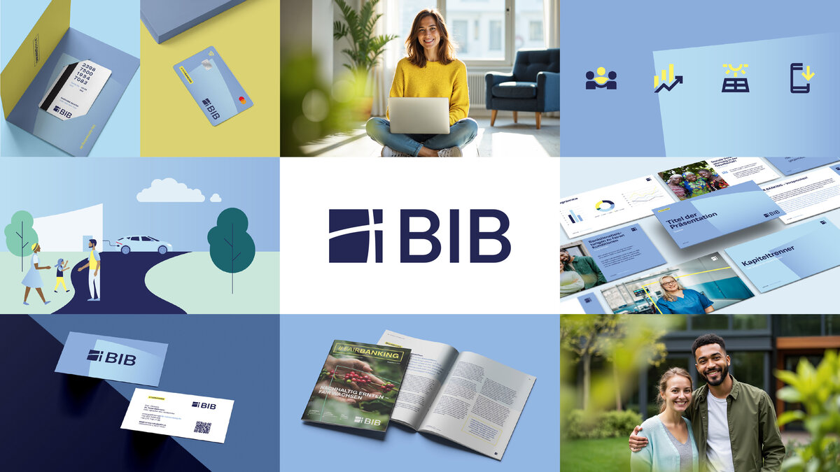
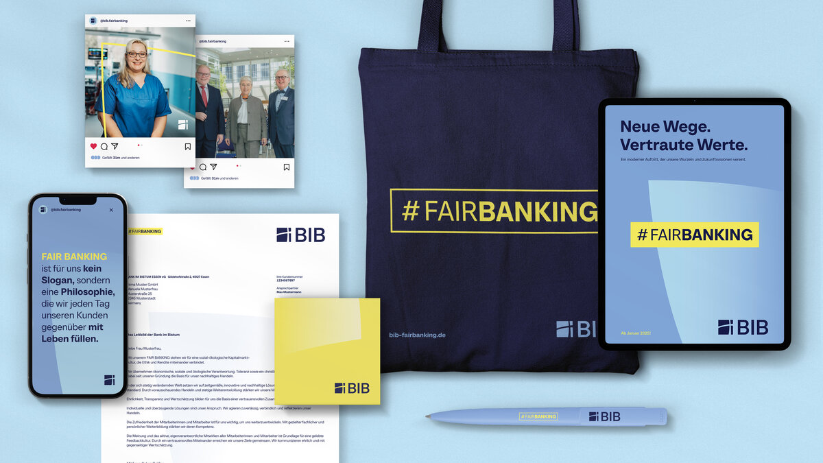
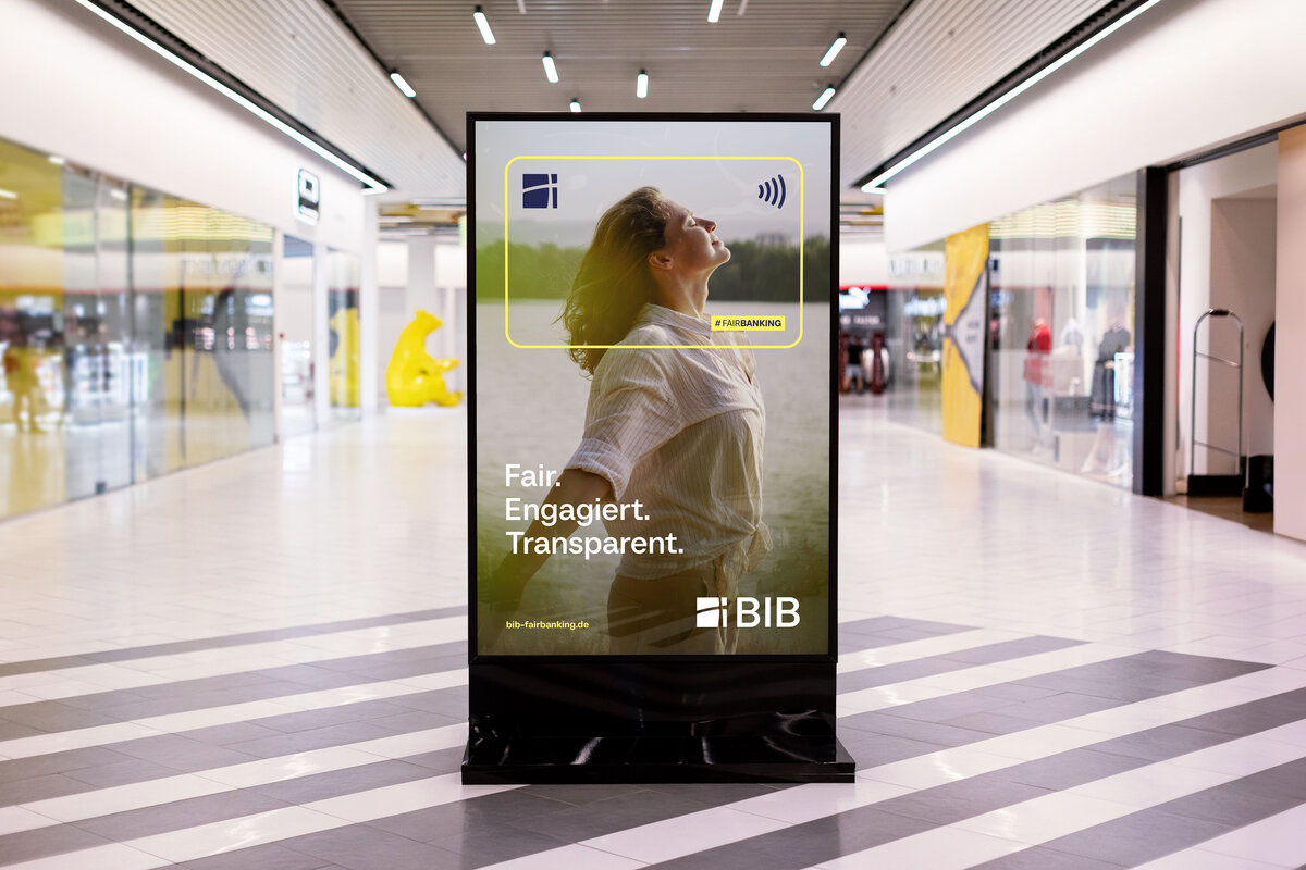
The Bank im Bistum Essen (BIB) represents Fair Banking – a value-driven financial approach with a clear focus on social responsibility and sustainability. 31M developed a new corporate design that fully translates these values into the visual identity. The relaunch modernized the logo, colour scheme, and typography while introducing the BIB Shines as a new design element. The Shines symbolize openness, clarity, and transparency, ensuring strong recognition across all media. A reduced, modern design and a consistent design system make Fair Banking instantly tangible.
The Jury‘s Statement
The Bank im Bistum Essen presents an outstanding example of value-driven brand work with its new corporate design. The visual identity impressively embodies the principles of Fair Banking, social responsibility, and sustainability. The introduction of the “BIB Shines” as a defining design element ensures unmistakable recognizability. The harmonious color palette, distinctive typography, and flexible design system combine aesthetics with functionality. This consistent, strategically crafted execution effectively positions the brand as a modern financial institution with clear values.