Schreinerei Huy GmbH
Winner
Excellence in Brand Strategy and Creation
Brand Design – Corporate Brand
Details
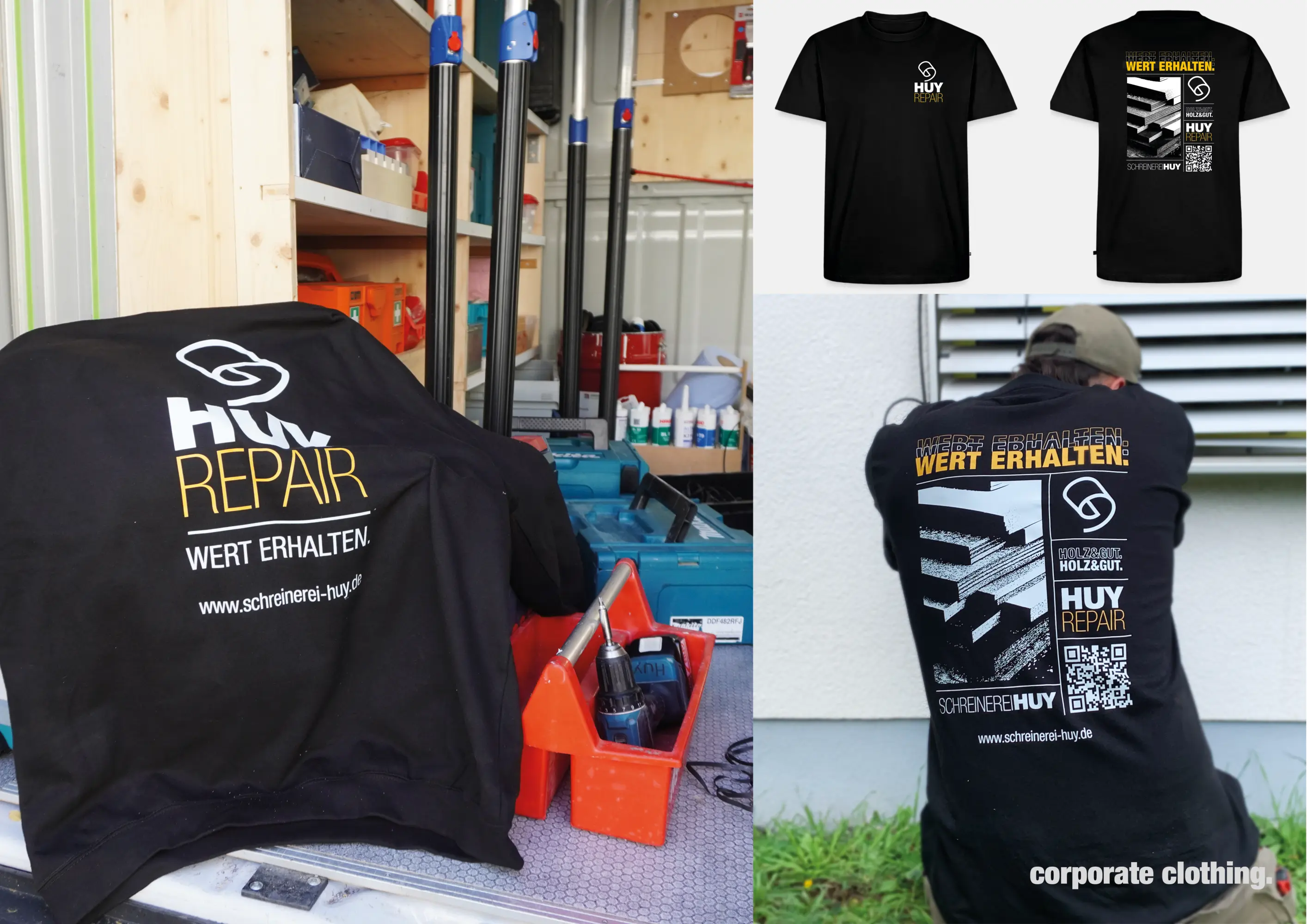
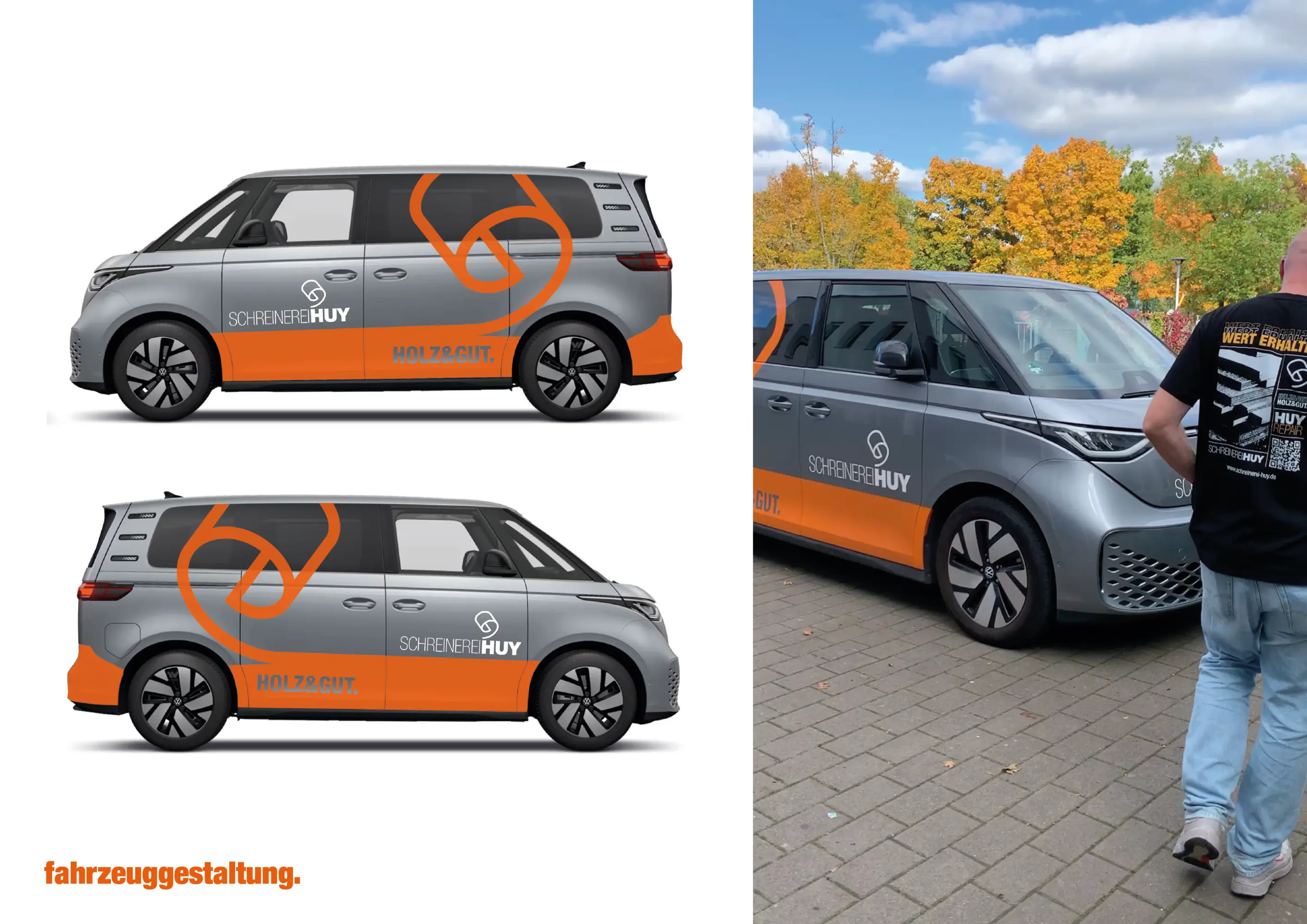
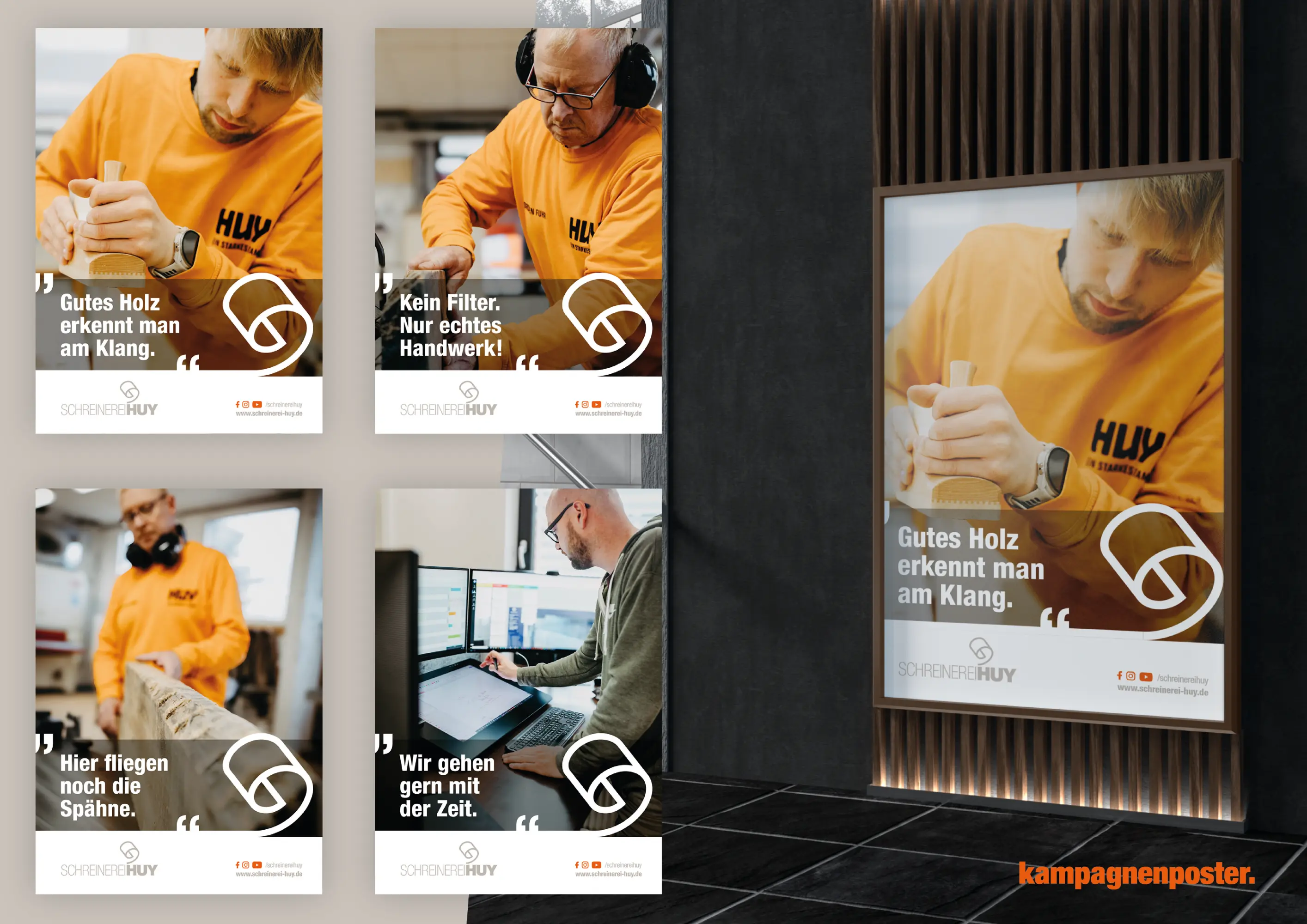
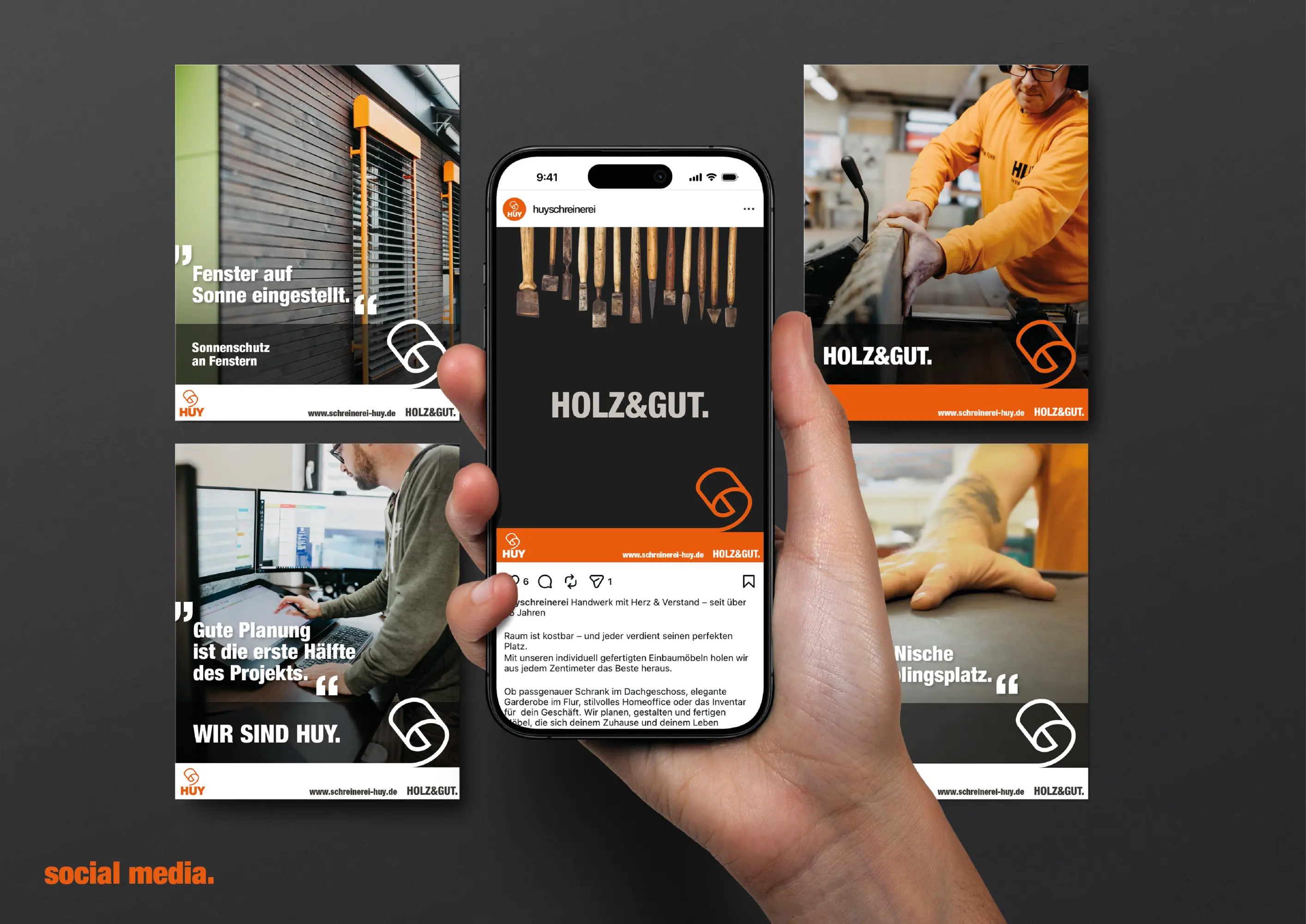
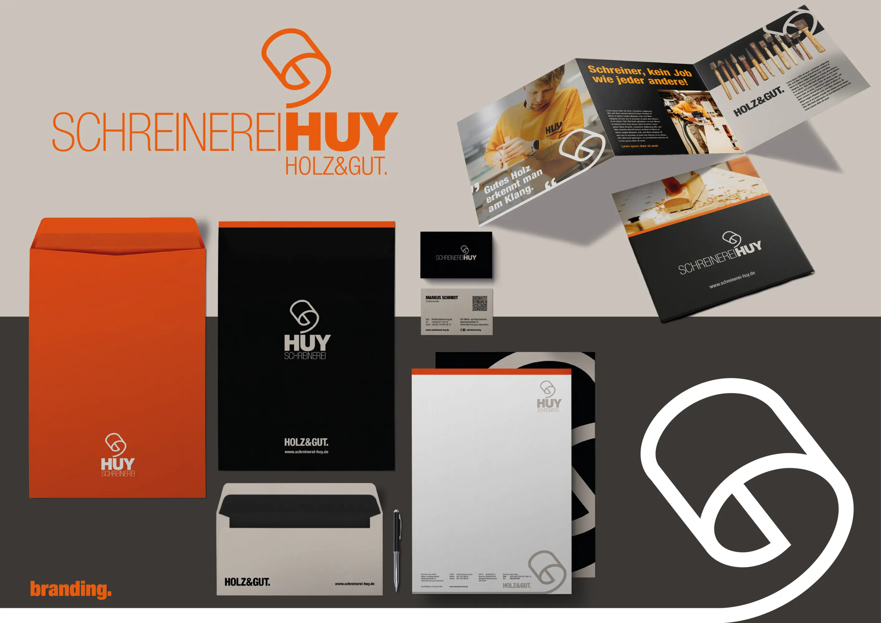
The rebranding of "Schreinerei Huy GmbH" makes technological progress and traditional craftsmanship visually tangible for the first time, transforming the company into a clearly positioned corporate brand. A distinctive, reduced logo ensures strong recognition and digital scalability. Warm grey tones combined with modern accents stand for quality, precision, and future orientation. With the newly developed sub-brand HUY Repair, the focus on maintenance, value preservation, and sustainability is sharpened, new target groups addressed, and competitive differentiation strengthened. Quality deserves a brand that makes it visible.
The Jury‘s Statement
Where craft heritage is strong, brand management often remains secondary. At Schreinerei Huy, the company now gains a precisely managed identity that visibly organises specialisation, process quality and future orientation. The reduced mark and clearly defined colour palette create a resilient visual presence across digital and physical applications. With "HUYRepair", a relevant service field is also managed as an independent brand element, sharpening the positioning within regional competition in a comprehensible way.