FOERSTER Brand Identity
Winner
Excellence in Brand Strategy and Creation
Brand Design – Corporate Brand

Details
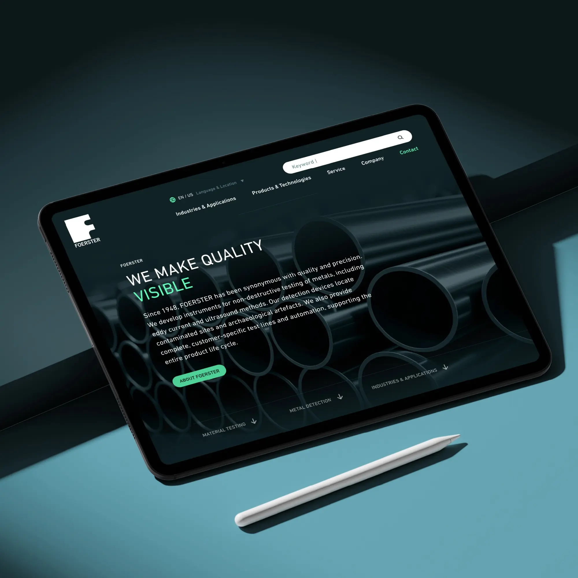
FOERSTER, a pioneer in non-destructive testing, faced the challenge of transforming a legacy, print-driven identity into a consistent digital brand. The new design translates the core promise “We make the hidden visible” into a clear, scalable system: precise typography, defined colour polarities between green and blue, and a reduced yet dynamic visual language. The result is a distinctive identity that conveys trust, technological excellence, and innovation leadership across all touchpoints worldwide.
The Jury‘s Statement
Between an established foundation of trust and growing digital demands, Foerster needed an identity that brings both together without diluting the brand core. The relaunch sharpens the brand through a clearly defined colour palette, precise typography and a reduced visual language that makes technical expertise visible. Crucial here is the system derived from this approach: it structures the website, key visuals and international applications so clearly that recognition arises not from habit, but from design logic.