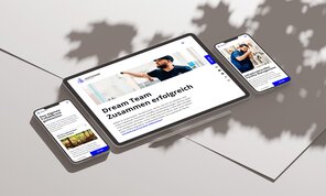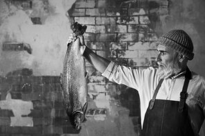


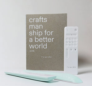
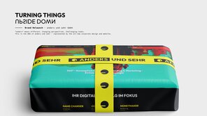
Markenrelaunch Schomäcker Federnwerk GmbH
Excellent Brands
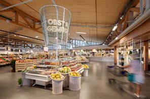
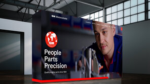
Industry, Machines and Engineering
Winner


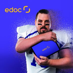


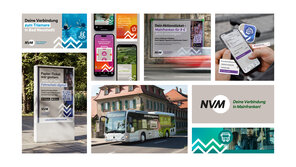


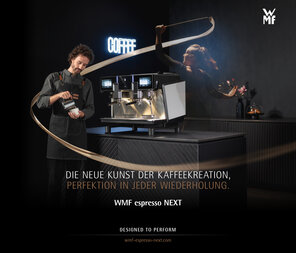


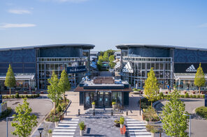

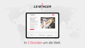


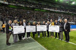


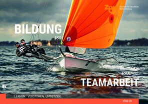


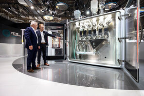


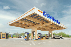


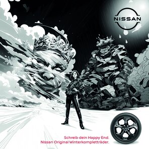
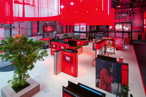
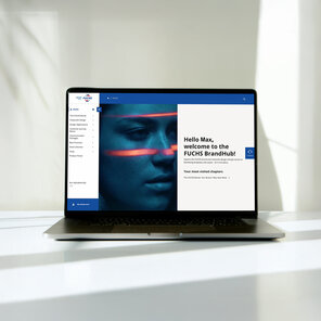
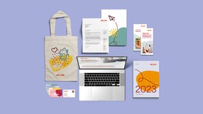
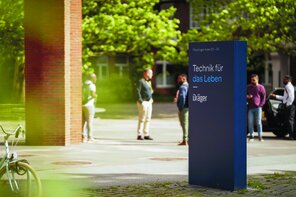
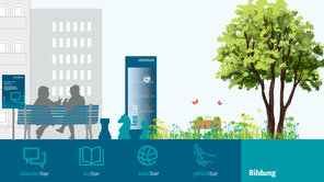
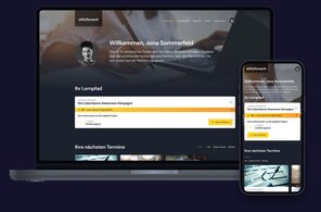
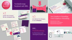
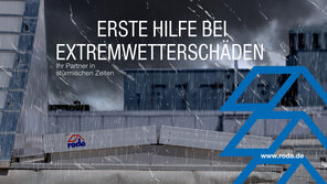
AEB get connected 2024
Excellence in Brand Strategy and Creation
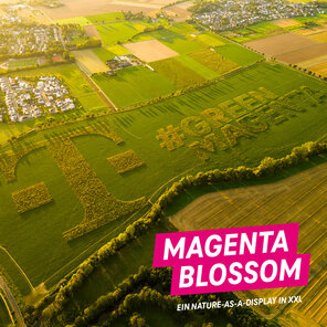
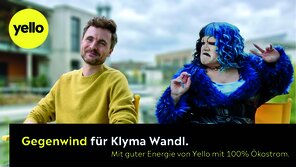
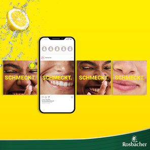
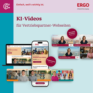
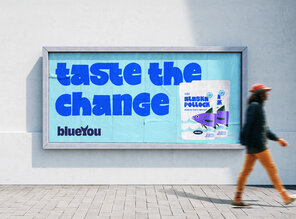
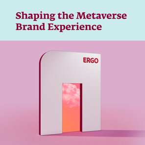
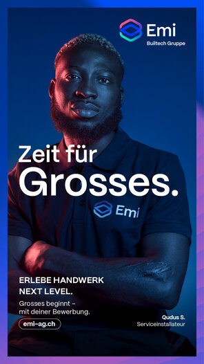
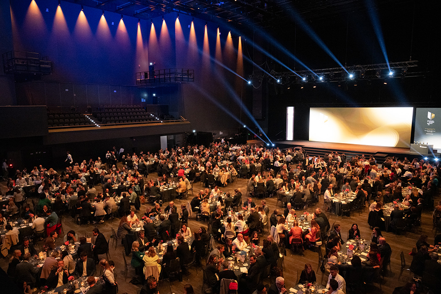
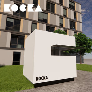
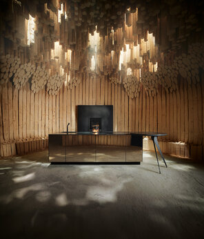
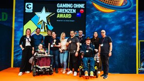
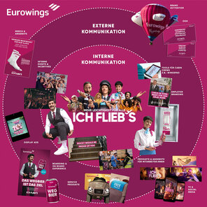
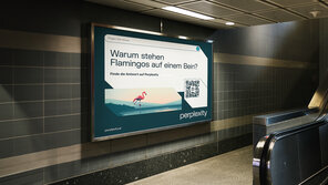
Brand Experience of the Year
Winner

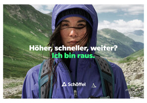
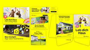
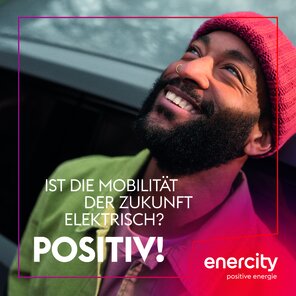
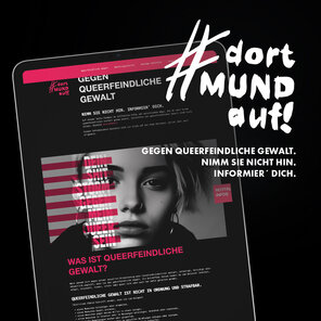
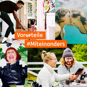
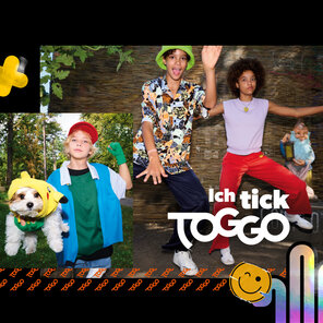
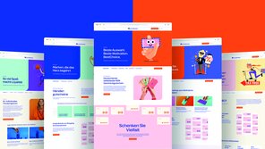
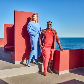
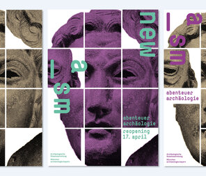
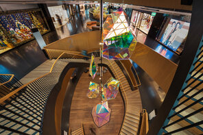
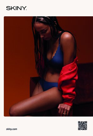
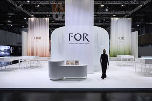
The New Norm
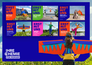
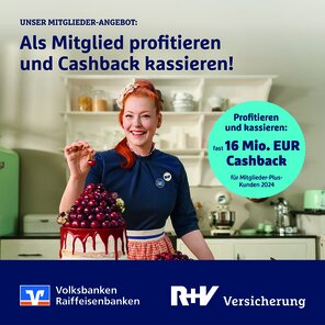
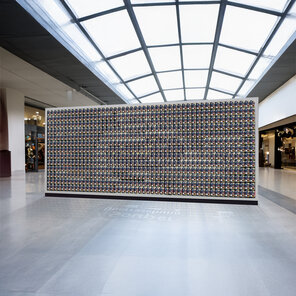
Excellence in Brand Strategy and Creation
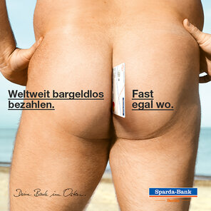
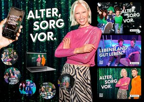
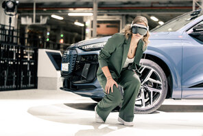
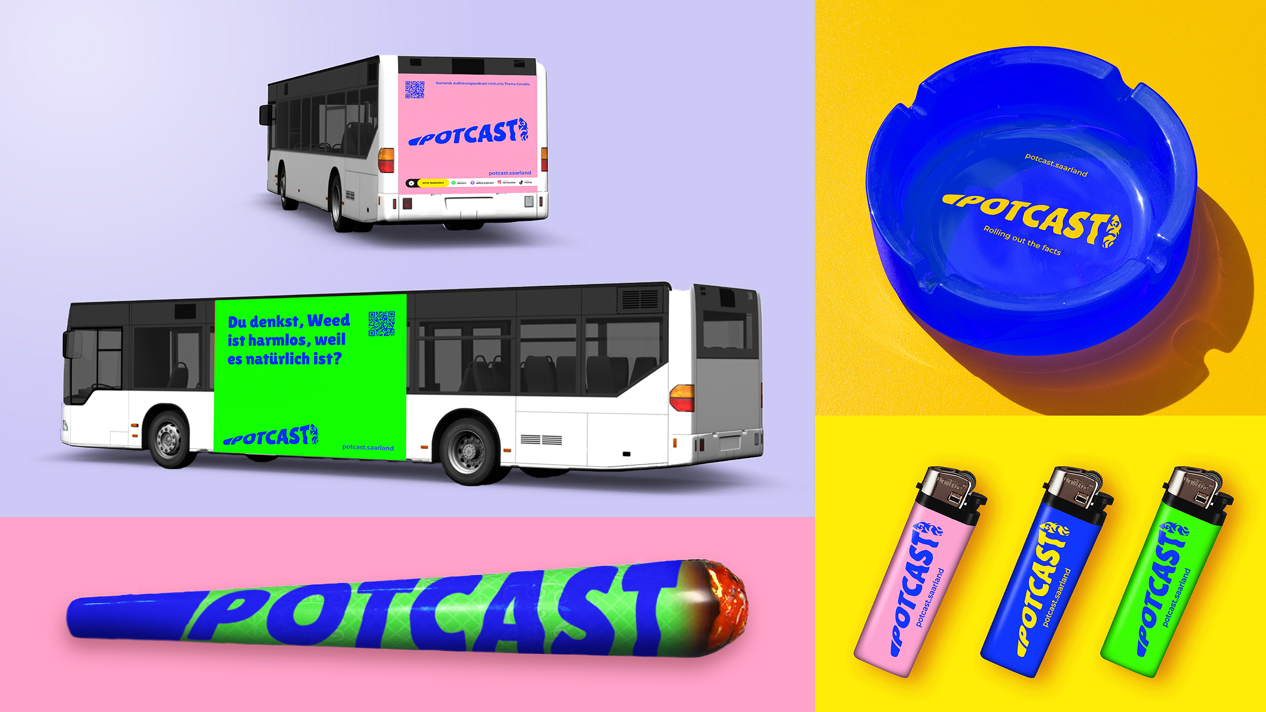
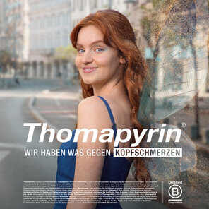
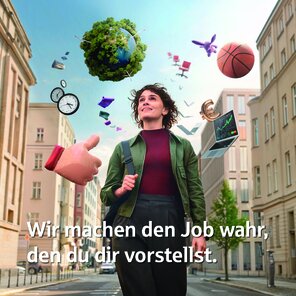
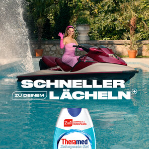
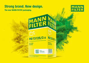
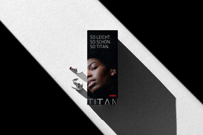
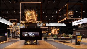
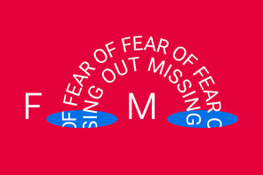
Brand Communication – Classic Campaign
Winner